Diving data in Power BI
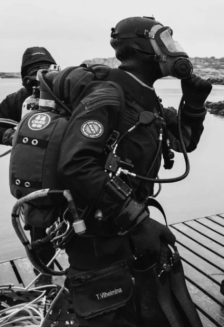
My sister in law has the same kind of passion for the ocean as I do for Power BI. She loves it it so many ways! She loves looking at it, swimming in it, diving in it, preaching about the dangers we pose to ourselves as a species by dumping toxic in there and destroying it. She recently got her S-30 diving certification and I always get so inspired when she shows pictures and stories of her dives and so this blog post is dedicated to her and her quest for a more healthy ocean!
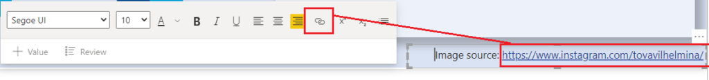
You can follow her on her instragram here for more information! https://www.instagram.com/tovavilhelmina/
I was sent the diving data export from her diving watch in raw format to see what could be done with it. I put together 3 screens that you can interact with here and I’ll break the building process down step by step for the rest of the blog post.
How it’s made
Overall screen
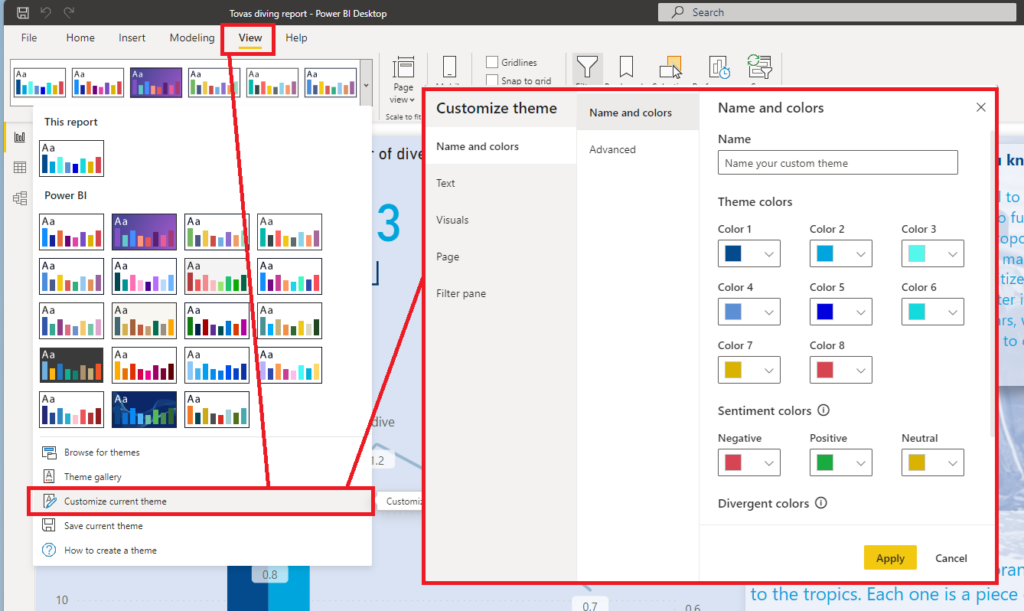
First things first. Setting a nice ocean like theme! You’ll find these settings under View in Power BI desktop. I set up a couple of blue colors from color 1 to 6.
Next I created a textbox under Insert like this:
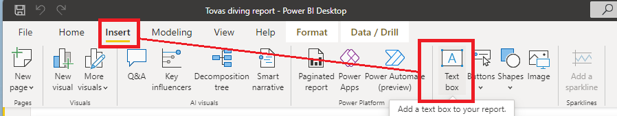
I put this text box in the bottom right screen on the first page to act as a template. After all, I want you to easily get from the report and off to Tovas Instagram for more information!
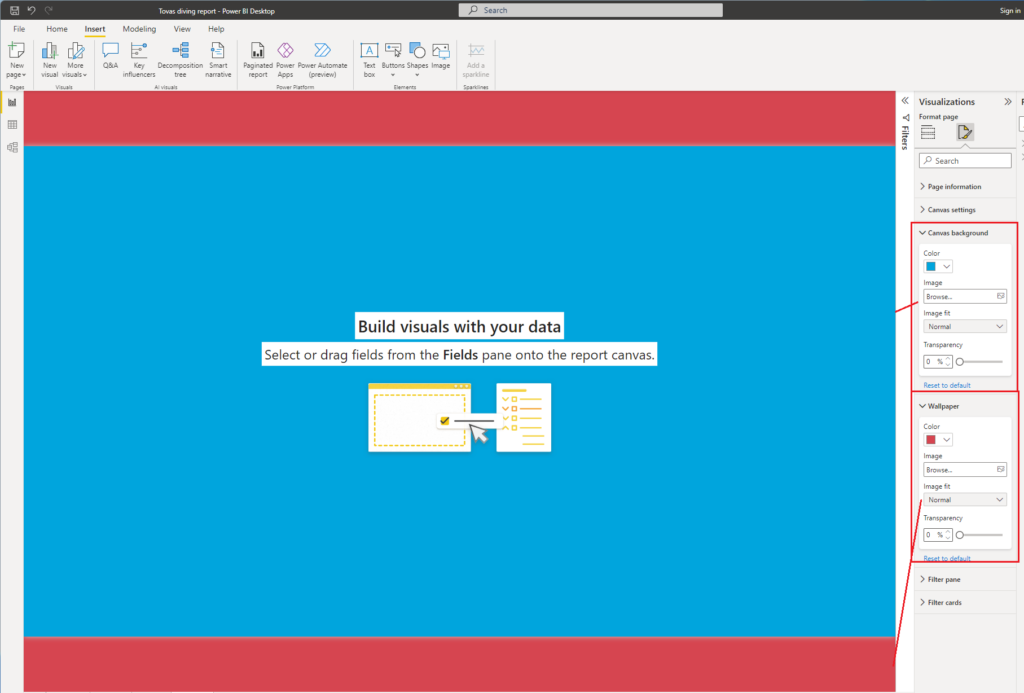
I then snatched a few images from her Instagram to serve as backgrounds on each page. In Power BI Desktop you’ll find you have 2 options for backgrounds though. Canvas Background and Wallpapers.
Use the Canvas background if it’s important that your image sticks to the same place all the time, like if you create a layout with boxes and you want the numbers or bar charts to always be in those boxes.
Use the Wallpaper if you want the rest of the screen to be filled with beauty as you stretch it around.
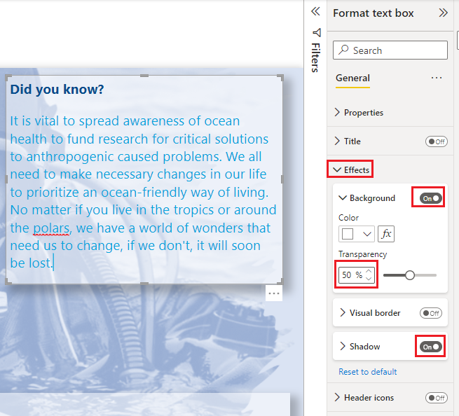
For all the text boxes, I’ve used a 50% transparent white background and dropped shadow to get kind of like a glassy effect. (Feel free to read the text and reflect for a minute as well).
To create this flow chart feeling, I simply added lines under insert and rotated the once going vertical by 90 degrees.
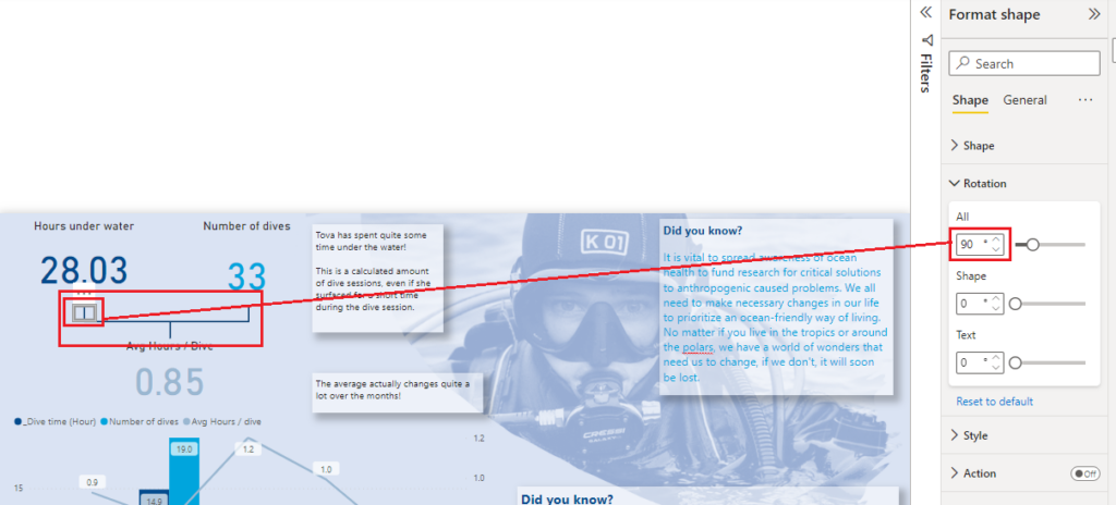
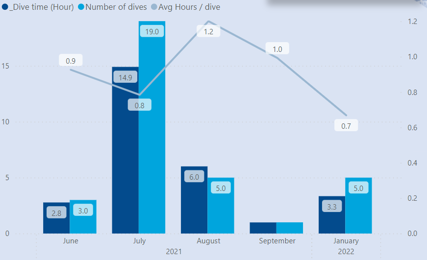
This way, it’s really simple to see how the numbers connect to each other! 28.03 hours under water divided by 33 dives gives about 0.85 hours per dive on average.
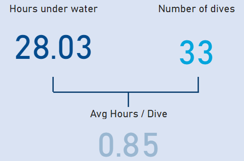
This is a great KPI, but there might be a lot of useful information hiding in there. Remember that is your job as the story teller to make sure the whole story is told. Don’t lie with statistics to suit your own agenda. In this case, it might for example be interesting to see all these 3 measures over time:
Alright but how are these measures calculated you might ask. Let’s have a quick look under the hood, shall we!
I recently made a blog post about dynamic segments that came in handy here.
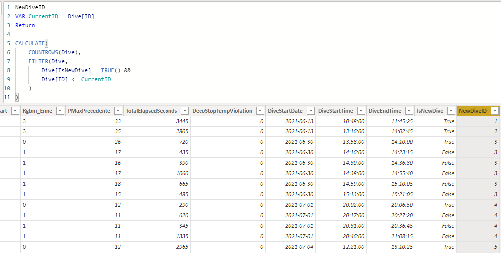
The data, in it’s raw form, looks like this:
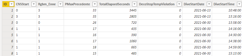
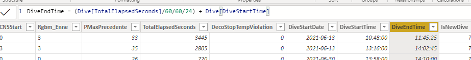
There’s a bit of an issue though. The dive watch measures a new dive each time Tova is breaking the surface. This might sound logical, but quite often she’ll surface and have a short discussion with her diving buddies before going back down into the depth again. It is after all not that easy to converse while submerged. The dive watch considers this a new dive but Tova does not. If she broke the surface again within 30 minutes of the last dive, she considers this to be the same diving session. To calculate this I’ve first created a DiveEndTime column to show the time by adding the TotalElapsedSeconds to the DiveStartTime:
After that, I created the column to determine if the dive was within 30 minutes of the previous row like this. I’m not goin to go into deeper details on this, but I have another post on the subject here that will go into depths!
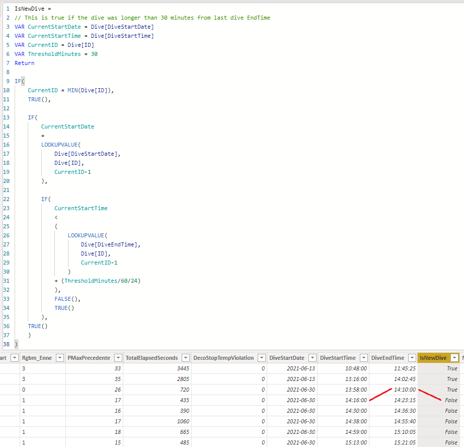
We can see that one dive started 14:16 and the one before ended at 14:10, thus this surface breakage is not considered a new dive.
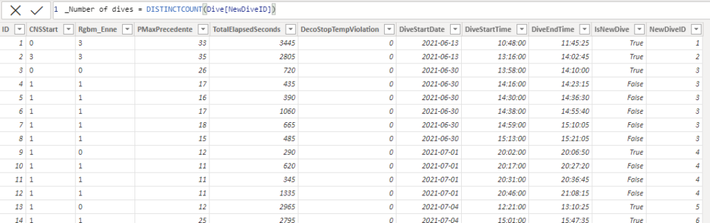
Finally I’ve created a NewDiveID column. Again, if you want to go into details, check this blog post on the subject!
Finally a measure that determines the distinct count of the NewDiveID:
Depth screen
On this screen I went into more details about the depth of Tovas diving. The overview looks like this:
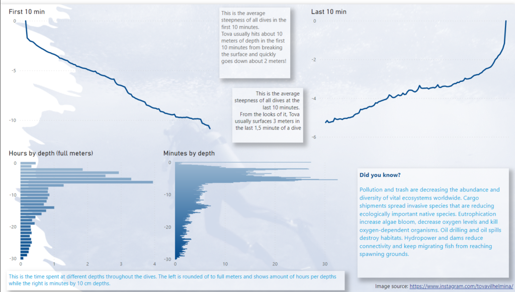
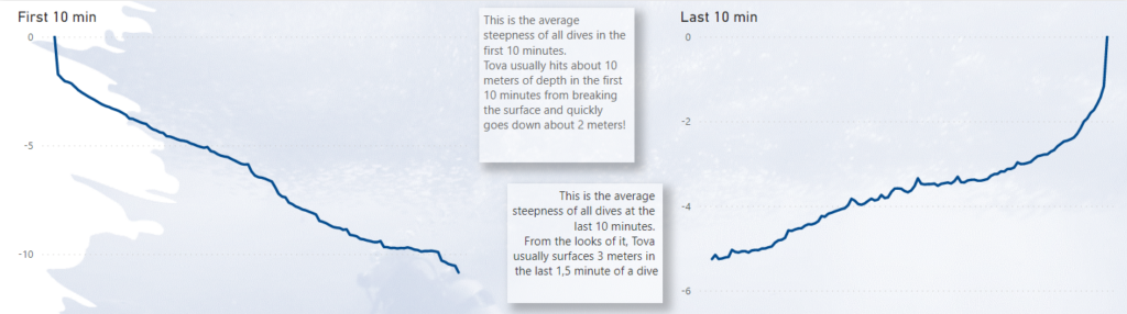
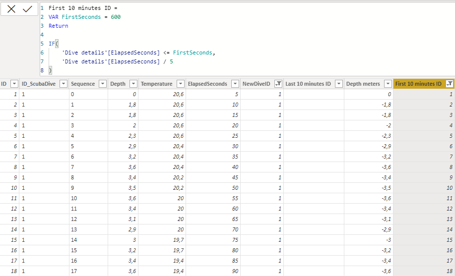
First I have a graph of the depth for the first 10 minutes of a dive and another for the last 10 minutes of the dive. I wanted to see how fast and deep a typical dive would be both when going down as well as going back up.
The value is simply the average of depth from the Dive details table. The axis is based of a calculated column where I set a threshold for how many seconds I wanted to capture and if the elipsed amount of seconds was below that threshold, I divided the amount of seconds by 5 to get 120 ID’s per dive.
I could of course just as simple have used ElipsedSeconds as axis and filtered to only show everything equal or below 600.
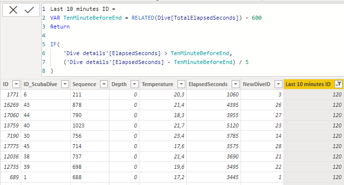
To get the last 10 minutes I do need a calculated column though! No shortcuts here, since each dive is different in length. Using this formula, I fetch the total elapsed seconds of the dive and subtract 600 seconds from it. That way, for each row, I know now if this specific one is within the last 600 seconds of the dive or not. Same process as before, I’m creating a new ID column but for the last 10 minutes.
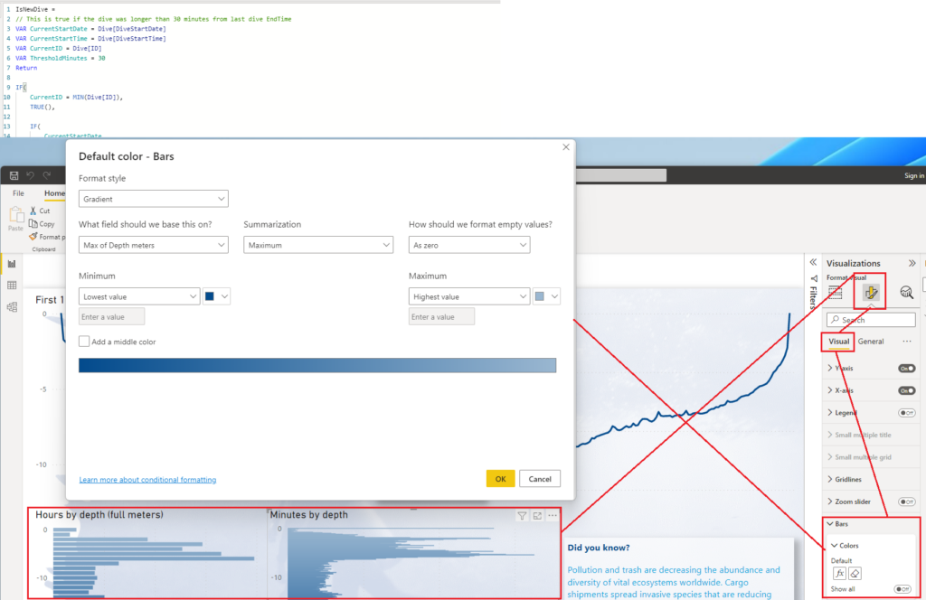
For the bottom part of the report, I’ve just created 2 column charts. To get the light gradient effect I’m using the Format Style Gradient instead of a solid color for the bars, like this:
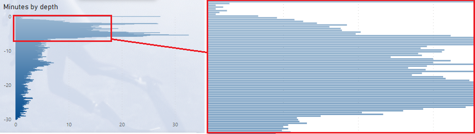
The right graph uses the exact amount of meters as the axis and calculates amount of minutes spent on that depth by looking at the amount of rows in the dive details times 5 (one row is 5 seconds) and divided by 60 to get minutes.
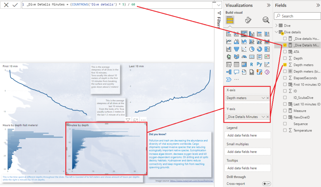
Depths meters have 1 decimal, diving about 300 measurement points for the 30 meters stored in the watch computer.
Looking closely, you’ll notice its actually a lot of bars, but I kind of like the solid effect you get by using so many axis points. It reminds of a area chart.
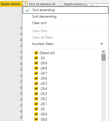
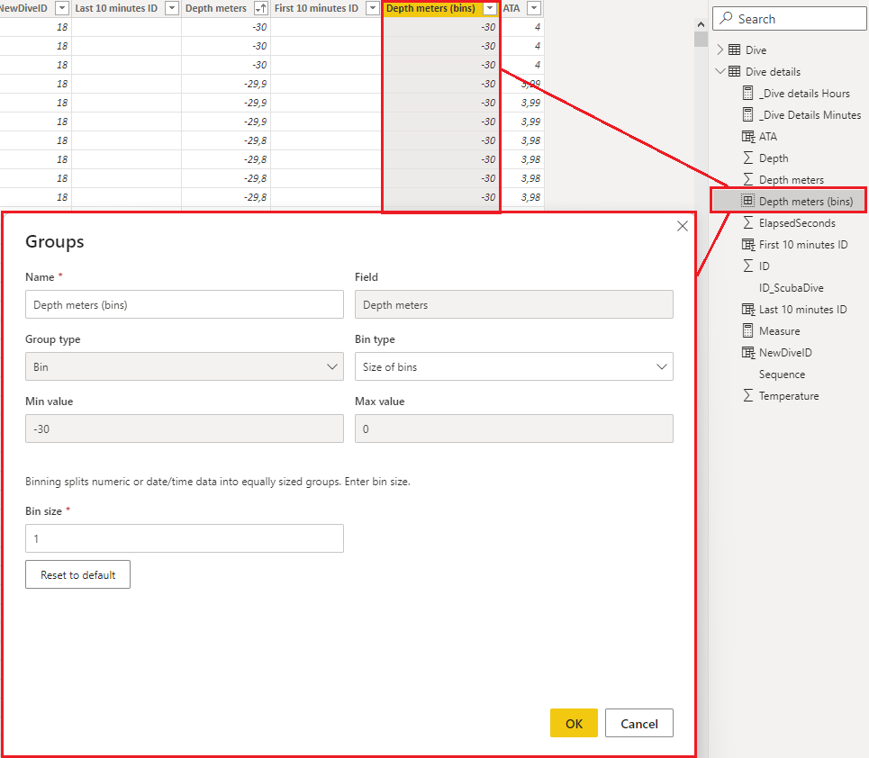
The graph of the left is binned by full meters to calculate hours spent at each 1-meter depth. I’ve binned the depth meter column like this:
Temp
The max temperature is a simple card with red callout value font color and the same goes for the coldest (min) but with blue color.
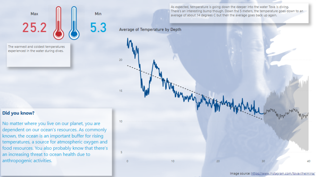
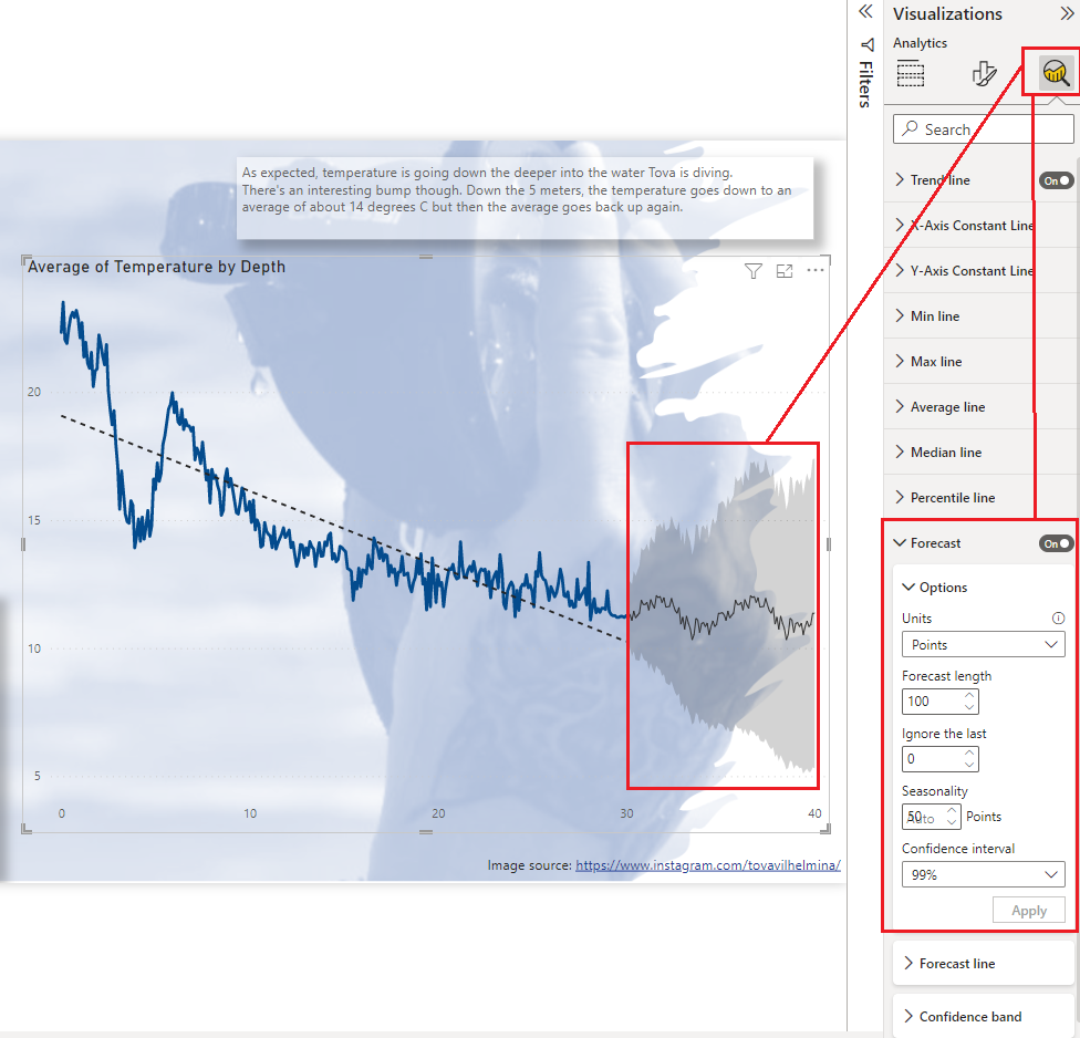
The gray area at the end of the graph shows a forecast, created automatically in Power BI. You can do this yourself like this (I did however needed to remove it when publishing the report so you can’t test this out in the web version above):
And with that, I’ve got myself a neat little 3-page report on diving. Hopefully someone could make use of the information in this blogpost and most importantly I hope you’ve read through the “Did you know”-blocks and learned something new about our oceans.
And for those brave heroes whom have scrolled all this way, feel free to use this link directly to Tovas instagram without the need to scroll all the way back up.
https://www.instagram.com/tovavilhelmina/
Until next time! Cheers!
This is brilliant! Thank you so much for this Ville! I had no idea my scuba diving could come in handy for your work with Power BI but I’m glad it did. 🙂