Colorful threshold in an Area Chart
The other day I though about KPI’s, as a totally normal person would. I think.
Anyhow, my mind drifted of to area charts and how it would be neat to set a threshold and change the color when you passed a certain line! When I got back to my computer I built this graph. This isn’t something you get out of the box in Power BI though, so if you want to build your own, here’s how!

Behind the scenes – setting up the 3 magic measures
The area above is built up based on three layers. The red-ish color in the bottom, the green color on anything standing above our threshold and finally the black line to frame the image nicely. Let’s begin with the line, since it’s childishly easy to make:
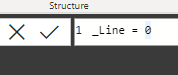
I told you it would be easy! All this measure does is present the value 0 wherever we put it. Let’s move on!
The next measure is our red-ish bottom. We want to increase the area up until our threshold (in my case, the threshold is 550).
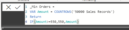
_Min Orders =
VAR Amount = COUNTROWS('50000 Sales Records')
Return
IF(Amount>=550,550,Amount)
What this will do is count the rows in our table of sales records. If the amount surpasses 550, it will cap it to 550, otherwise it will show the number. Since any measure is calculated based on the context in which it’s in, whenever a month has more than 550 sales we’ll simply cap it 550 in that specific month.
The next measure is the green-ish peaks! They’re measured the same way, only reversed.
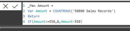
_Max Amount =
Var Amount = COUNTROWS('50000 Sales Records')
Return
IF(Amount<=550,0,Amount-550)
Essentially, when the amount is above 550, we’ll take that amount and reduce 550. Let’s say a month has 570 sales. That´s above 550! We’ll then take the amount and reduce it by 550. 570 – 550 = 20. The green peak will be 20 and we’ll get the other 550 sales from the _MIN Amount measure we created earlier.
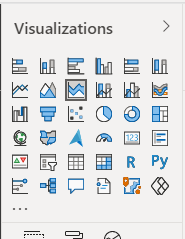
Let’s get started with the visuals!
Create a stacked area chart! It needs to be stacked, so that each area stacks on top of anything below. It’s the third from the left in the menu here.
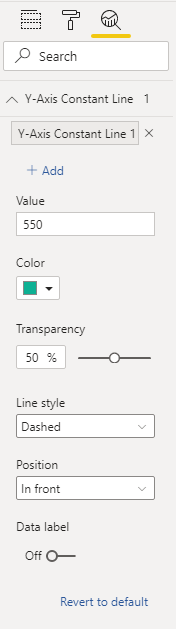
I’ve added a constant line at 550 to further show my threshold like this:
My workspace now looks like this:

I’ve added the order date as my X axis to get a timeline. In the value field, I’ll start by adding the _Min Amount to get the bottom section of the graph.
Well what do you know?! It goes to 550 but never above!

Let’s add the _Max Amount on top of this! Or to be fair, it’s actually below in terms of where you stack the value on the right side 😉

Finally adding the black line to frame it a little better looks like this:

And using the zoom bars where able to look into better details at the results:

That’s all there is to it! Now please go out into the world and make a beautiful theme that will make these rather ugly visuals get the looks they deserve!
Cheers!
After research a couple of of the weblog posts on your web site now, and I really like your approach of blogging. I bookmarked it to my bookmark web site record and shall be checking again soon. Pls check out my site as well and let me know what you think.
Enjoyed looking through this, very good stuff, thanks.
This website was… how do I say it? Relevant!!
Finally I’ve found something that helped me. Cheers!