Machine Learning and Power BI
Everyone seems to be talking about ChatGPT and similar AI solutions now in the beginning of 2023, so I figured I’ll share some thoughts on the machine learning features currently built into Power BI!
I should however clarify that these are Premium functions in Power BI.

To kick it off, let’s first segment the Machine learning features in Power BI into 2 segments:
- Power Query
- Visuals
In Power Query, we transform the data and machine learning can help! Let’s have a look at how!
When you have the Power Query window open in Power BI, you can add new columns based on the data in your query. While on the tab of “Add column”, you will find “AI Insights” all the way to the right.
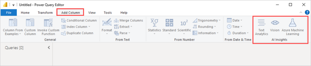
Text Analysis
For Text Analytics there are 3 different options:
- Sentiment
- Keyword extraction
- Language detection
Language detection seems pretty obvious, right. You select a column containing text and the new column you create from the AI function will tell you what language the current row was written in.
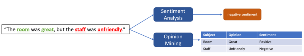
Sentiment is kind of like a grading scale where you get 0 – 1 (or 0%-100%) based on how positive the sentiment is of the text selected. This is really useful when for example analyzing feedback data from surveys as it would take a very long time to read through all answers individually. This might need to be done as well, of course, but to get a quick insight in your Power BI report, sentiments are simply quicker.
OK so far so good, but what about keyword extraction? As the name suggests, you can use it to extract certain words from your texts that will be easier to group by later on. If you have a descriptive text, Power BI can extract some words from each row that seems to be more important to the context and thus giving you a pretty good idea on for example which answers of your survey has to do with certain things. Another cool thing is that keyword extraction could also be used together with opinion mining for a more detailed sentiment analysis!
Vision
This section is, perhaps to no ones surprise, about images. Let’s say your dataset has paths to images in it that you want to analyze. Again it could be survey data where you have asked all respondents to snap a picture of what they like best about their workspace. Instead of going through each and every image, Power BI can determine what’s in the images and then you can try to find common factors for what seems to create the best workspace!
Basically, the image is broken down into objects that can be found within it and then the machine learning model will give a confidence score on how sure it it that this object is within the image.

Azure Machine learning
What if you want to use your very own machine learning model from azure? No problem! Just select the third option and get a list of your available models.
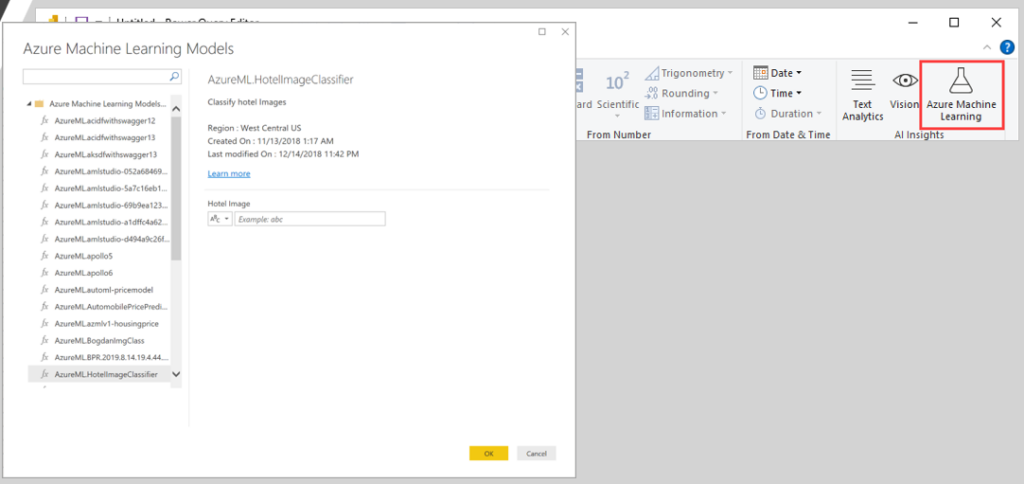
Let’s for example say that you work for an insurance company or a bank and you have set up machine learning model for predicting credit score or maybe you have a model that is used to find illness patterns from sick leave. Sky is the limit!
Visuals
All right so that was Power Query, but what about machine learning in Power BI Visuals?
There are a few visuals in Power BI that makes use of machine learning:
- Line chart (Anomaly detection & forecasts)
- Decomposition tree
- Q&A
- Key influencer
- Smart narrative
Line charts
When you create a line chart in Power BI, you can add “Find anomalies” and the graph will get this grey shadow area surrounding the line. This grey area indicates what Power BI, using machine learning, expects the value to be. If the line is within the area, all is fine! If the line is outside, that point will be highlighted and selectable for further analysis.
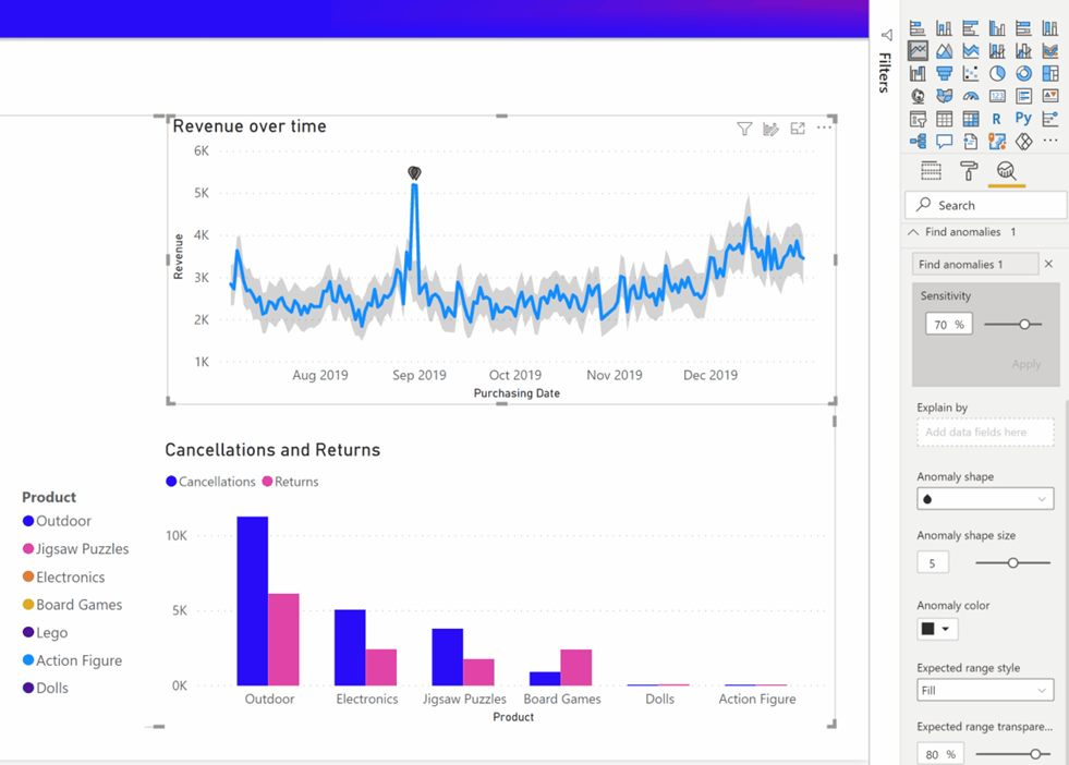
When clicking on the dot in the chart, the end user can get suggested explanations of the anomaly automatically.
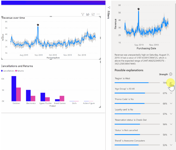
Get started and read more here: https://powerbi.microsoft.com/en-us/blog/anomaly-detection-preview/
Forecasting can also be added to your line charts and it will create a new, grey area that will show how Power BI predicts the graph will continue into the future. You set the time frame and confidence level yourself though.
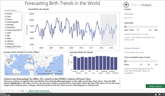
Get started and read more here: https://powerbi.microsoft.com/fr-fr/blog/introducing-new-forecasting-capabilities-in-power-view-for-office-365/
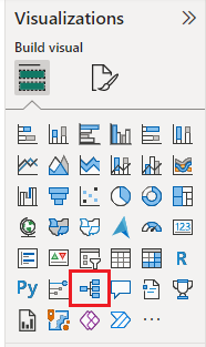
Decomposition tree
The decomposition tree is a great tool to find root causes in Power BI! You just start by selecting the visual, add what you want to analyze (like an amount of something) and then what to explain it by (the dimensions).
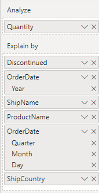
Now you can start to select your path ways through the dimensions like this. You select the order that the explained by dimensions come in
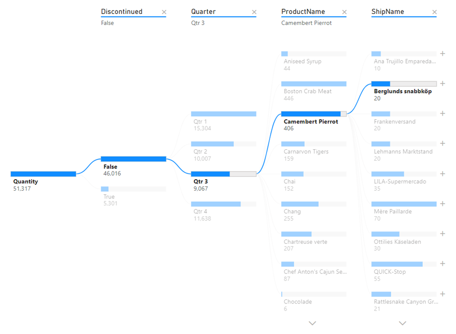
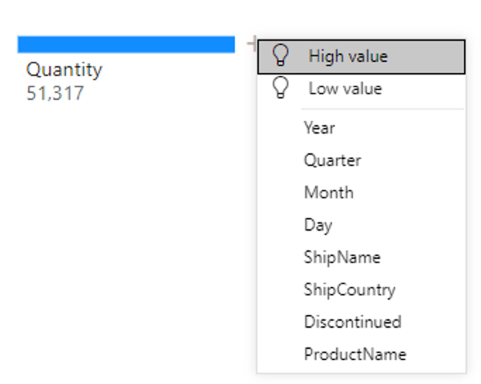
But hey, this was supposed to be about Machine learning! The automagic of the decomposition tree is that you can, at any time, select highest or lowest influencing dimension when expanding the explanation! Instead of selecting ShipName or Quarter (as per my example) to see what is happening, you can have Power BI selecting the grouping with the highest or lowest values automatically.
Q&A
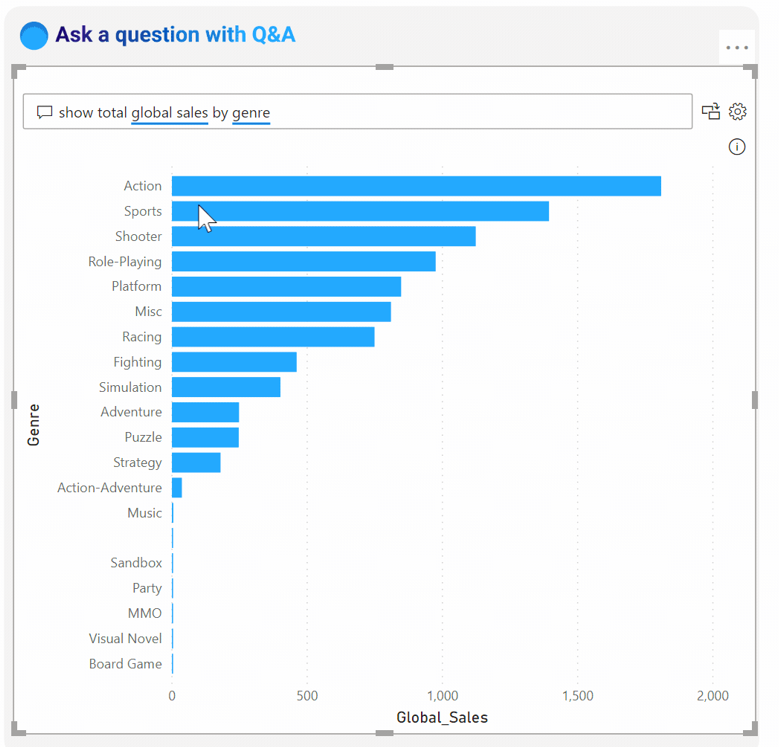
Let’s say you want to create a graph or get an insight that is not available in the report because people like me (who builds reports) have not thought about this specific insight that you would like to make.
Wouldn’t it be nice if instead of requesting it from a person and sit back and wait, you could just ask Power BI for the insight?
That’s what the Q&A visual does! You just add it to your report and the user gets a text box where they can type in any kind of question they have about the dataset. Power BI will visualize it as it seem fit. Sometimes you get graphs, stacked column charts and lists. Most importantly, you get your insight!
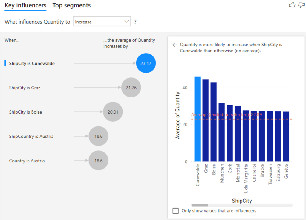
Key Influencer
The key influencer visual wants the same kind of input as the decomposition tree. You analyze some value over a bunch of dimensions that you believe have influence over the value.
The Key influencer visual will then tell you what the biggest influencer is of the value increase or decrease!
OK so this visual look cool right. But now that it is created, I already now what the biggest influencer is so why do I need to add it to my report?
I have 2 reasons for you:
- As new data comes into your dataset, the key influencers might change
- Everything on your canvas page is interactive
What I mean by the second bullet point is that your users can interact freely with the report page and they might filter on their own companies, cities, regions, countries, departments or any other kind of segment (and in multiple combinations). This filters what data is going into the key influencer visual and it will make new calculations, meaning you have virtually endless abilities to let your users make insights that you yourself would never have made while building the report.
Smart Narrative
In the past, you would often need presenters in the form of humans to explain the report you are looking at. This makes little sense when machine learning AI could easily replace such humanoids!
With Smart Narrative, Power BI can explain insights in an easy to understand text box. But is this really that powerful? Well, have a look and then tell me if you’re impressed or not, OK.
I have connected to the Northwind dataset and created this simple bar chart.
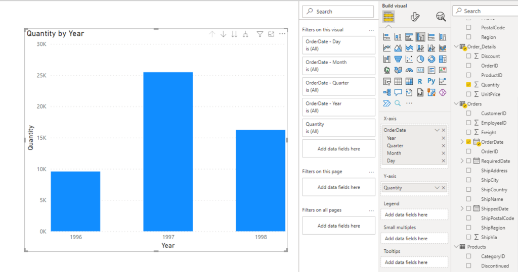
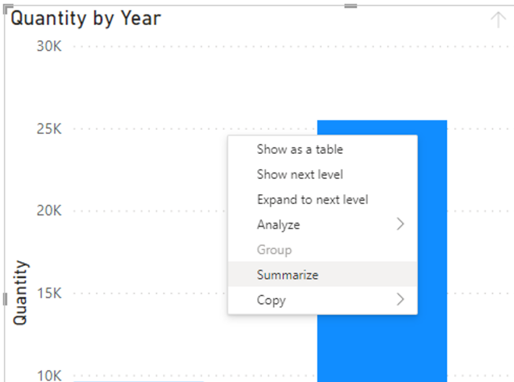
Now all I do is right click on the graph and select Summarize.
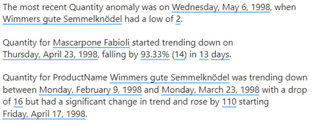
Power BI creates a dynamic textbox where the underlined values will change depending on the filtering you are making on the page:
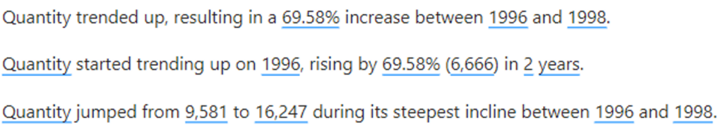
Still not impressed?
OK let’s add products to our X axis like this and see what it says now when we summarize.
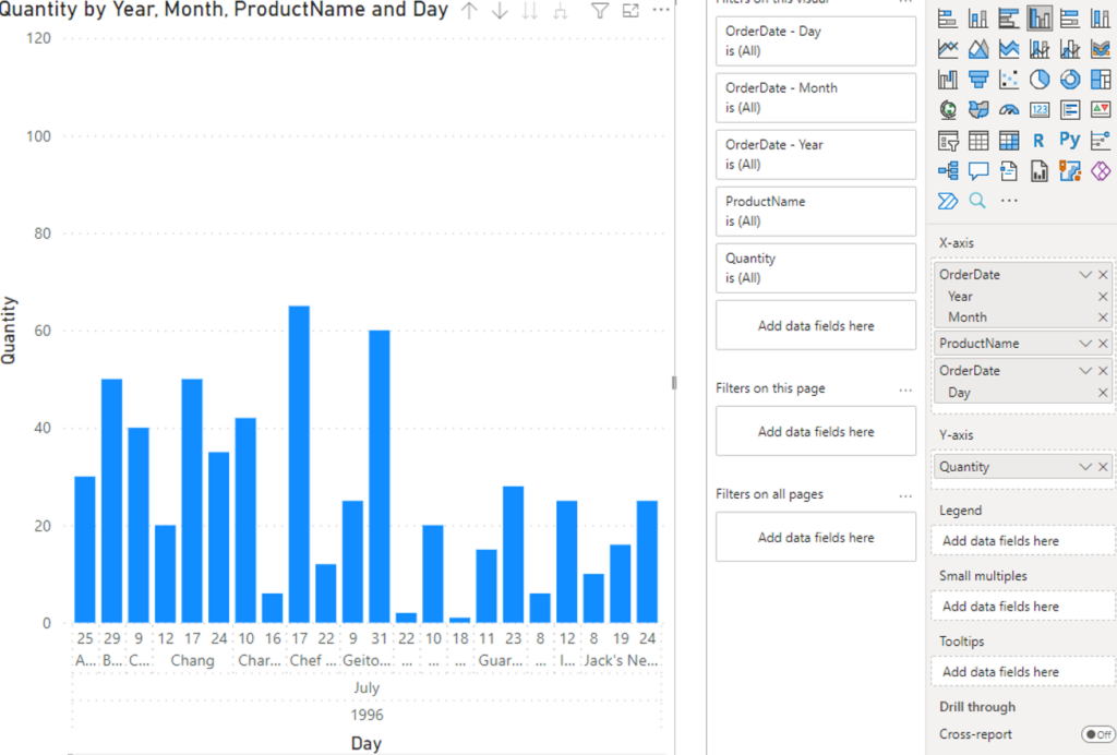
And now think about how long it would have taken you to get to these conclusions yourself.
Now head into the world and make it a more insightful place!