Backlog sample
I recently made a backlog in a report for a customer and figured that this is the kind of stuff the internet could make use of too! I’ve created a sample PBIX-file for anyone to download and copy coding samples from to save some time when creating your backlog or to learn from.
The sample report looks like this, it’s clickable and you can try it out online or download the PBIX-file from Github and play around in Power BI desktop by yourself! It’s free!

The idea with a backlog is that you want to see for example the amount of open support tickets, the amount of cars being produced at this specific moment or through history etc.
The equation behind the backlog is simple. You sum up everything from it’s start and stop counting it when you reach the end of it. Let’s say you want to see the amount of people inside a store at any given time (useful during a pandemic perhaps?). Anytime a new customer enters the store, it adds 1 person to the people inside, right? And any time a person leaves, it reduces the amount by 1.
If a person enters the store at 08:05 and stays until 08:25 and another person enters at 08:15 and leaves at 08:30, then the backlog would look like this:
08:00 – 0
08:05 – 1
08:10 – 1
08:15 – 2
08:20 – 2
08:25 – 1
08:30 – 0
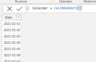
To create the backlog in Power BI, start by creating a dimension table with all the unique values of possible start and ends. In my example, which is the usual case, it’s a simple calendar with each day.
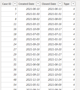
In my other table, I have all the cases. For simplicity I only have these columns. You can have many more, the important thing is really that you have at least 1 date column.
To create the Backlog measure, copy and paste this is change the table and column names
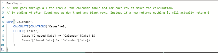
Backlog =
// SUMX goes through all the rows of the calendar table and for each row it makes the calculation.
// By adding +0 after Countrows we don't get any blank rows. Instead if a row returns nothing it will actually return 0

SUMX('Calendar',
    CALCULATE(COUNTROWS('Cases')+0,
    FILTER('Cases',
        'Cases'[Created Date] <= 'Calendar'[Date] &&
        'Cases'[Closed Date] >= 'Calendar'[Date])
    )
)
The measure will go through all rows of the calendar table and for each row, count the amount of rows that is on or after the created date but before or on the closed date i.e. it’s currently open.
On an area chart it looks like this:

The reason why I would do this as a measure and not as for example calculated columns as you would probably have done it in Excel, is that a measure is calculated based on the context it’s in.
In simple English, it means that we can apply filtering and clicking around in the report freely! Like if we’re selecting only Type 1 cases. The graph changed to it’s new condition!

Another good view here would be to show the amount of created cases versus the amount of closed cases on a monthly basis. The measure looks like this:

Closed cases =
SUMX('Calendar', // Sumx will go through every row of the Calendar table when it's calculated so that we can make evaluation for certain lines, like "the 3rd of may"
    CALCULATE( // We'll use calculate so that we can add the filter later on
        COUNTROWS('Cases'), // This will count all the rows of the Cases table
        FILTER('Cases','Calendar'[Date]='Cases'[Closed Date]) // The counted rows above are now limited to only include those closed the same date as the line we're currently at in the loop of SUMX
    )
)
To make the measure for Created cases, simply copy the above and change the Filter column at the end.
The graph of the above could look something like this:

By selecting a month, we see the backlog over days. All we know from the diagram above is that there where more closed cases than created cases in July. By clicking on July however, we can see that there was actually a bunch of cases created in the beginning of the month but at the end of it, the month began with more opened cases than it ended with.
