Swedish housing shortage in Power BI
The Swedish National Board of Housing, Building and Planning, also called “Boverket” have published some open data on the housing shortage in Sweden.
It’s a 45 MB Excel file and it’s supplemented with a view file where you can find a couple of pre-made tables to simplify the digging through the data. Naturally, I could not stay away after I heard about this dataset and so I’ve wrapped some Power BI magic around the Excel file and I’m publishing it here for anyone to make use of! The rest of this blogpost describe how to use the report. I often say that the Power of Power BI is that me, the report builder, is often not the one drawing conclusions and making insights out of the reports I’m building, since I’m creating the ability for others to untangle their own data. This is hopefully one of those cases! Let’s dig in!
Click here to open the report in a new tab!
Click here to go to GitHub where you can download a copy of the PBIX file and make improvements!
General overview
The report structure (the report is in Swedish as 99.9% of the potential users will be Swedes, so bear with me that some words in the blog post also will be in Swedish)
- Översikt
- Trender
- Jämför mellan kommuner
- Förändring över år
I wanted to add something more to this report and not only give you a more simplified way of filtering the Excel file. You’ll be the judge of my success.
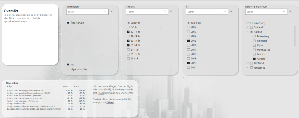
Översikt
The entire page looks like this with grey filters on the top row and some data presented beneath. This layout follows through the other pages as well.
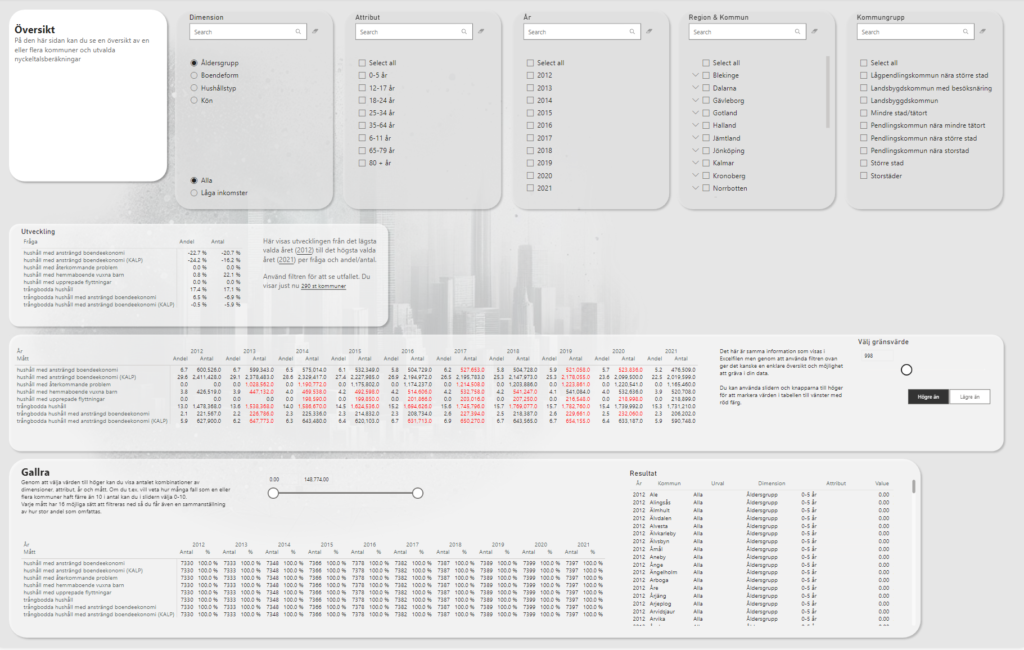
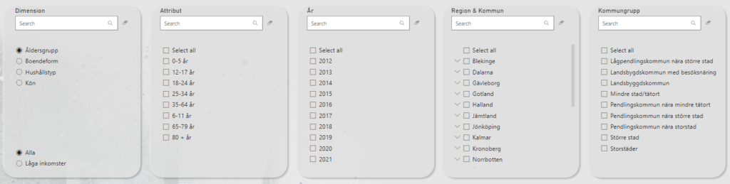
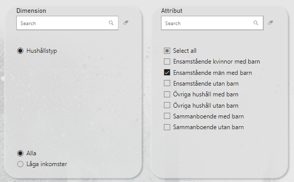
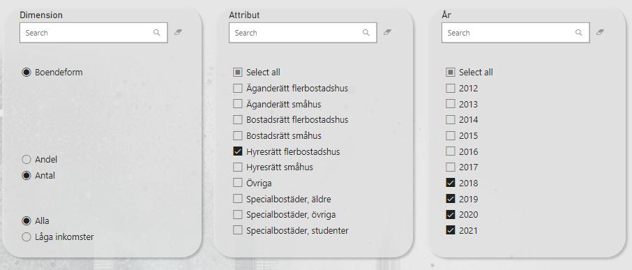
On each page you need to select a dimension and you need to specify if you want to look at everyone or just the ones with low income. In these cases you can only make one selection while the other filters can have multiple items selected (or none which is the same as all).
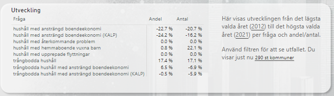
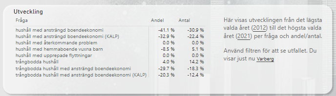
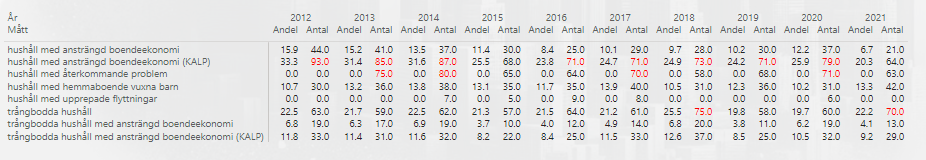
First we have a small overview of each measure. This show measure as a row and the change of value from the first to the last year. With no filters, this means the 2012 value is compared to the 2021 value for all 290 municipalities.
Selecting only one municipality will change the table like this.
Within this municipality you can combine more filters as well! This for example will only include 3 age groups (that doesn’t need to be side by side) from 2015 to 2020. You can also include multiple municipalities if you want to summarize their amounts (or get the average for share (andel).
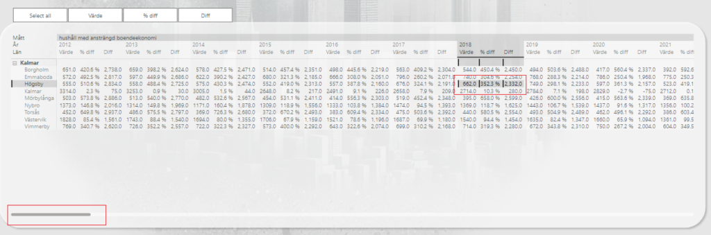
The next section shows the summed and average values from the Excel file as is, but you have the ability to highlight values using a slider and a button for higher/lower than. In this example, I’ve selected Kumla and set a threshold to highlight values above 2532.
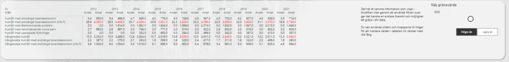
If I filter the page on household type and make a selection, the values will of course be smaller.
This time I set the threshold to above 70 instead.
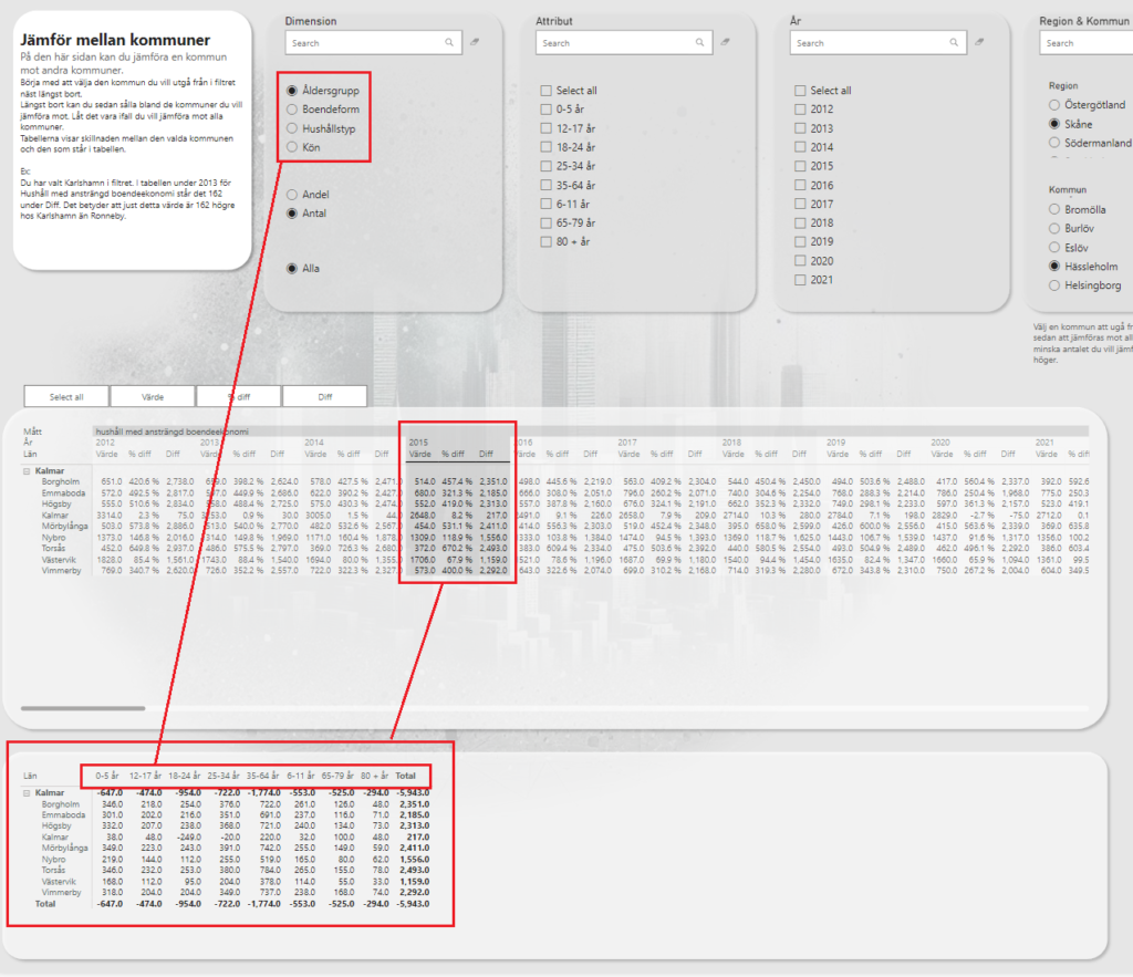
The last section of the first page is meant to find dimensions rather than to show values.
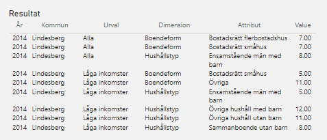
Step 1 is to select one or more municipalities to dive into. I’ve selected Lindesberg now.
Step 2 is to set the slider to some relevant values. In my case, 5-12. This means that all the values from the entire Excel file will be filtered to only include the cells where the value is 5-12 (including 5 and 12).
The numbers in the table represents the amount of dimensions where such a value has been found and how many of the total dimensions this represents.
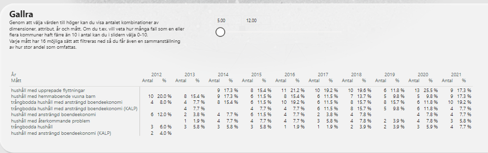
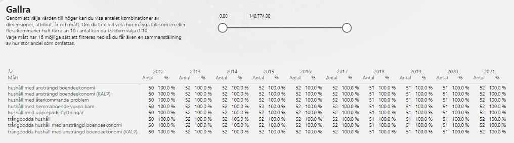
OK so let’s explain that a little bit further to make sure you’re following. Without filtering on the values, we can see that the measure “Hushåll med upprepade flyttningar” can be filtered in 52 different ways in 2014.
When making the filter above, we got 9, representing 17,3%. That’s because out of the 52 possible ways we can slice the measure of “hushåll med upprepade flyttningar” in 2014, 9 of the ways represent 5-12 people/households.
So now what? Well now we can select the 9 dimensions by clicking in the table and on the right side, we get the see the values!
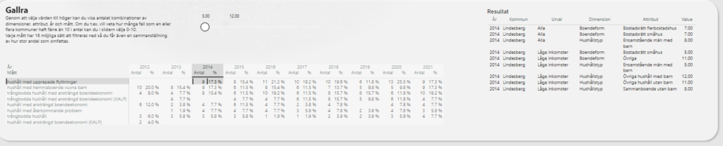
Let’s zoom in. Imagine going through all these 52 possible combinations (oh, did I say 52? That’s per year. We’re looking at over 500 possible way you can filter data to find these). Now that you have found them, you might want to look further into these dimensions and compare them over years etc. This is meant to help you find what might be interesting to look further into.
Trender
OK so this is one very cluttered page! Bear with me though, it’ll make sense soon enough. All you need to do is filter it down by a smaller sample of municipalities.
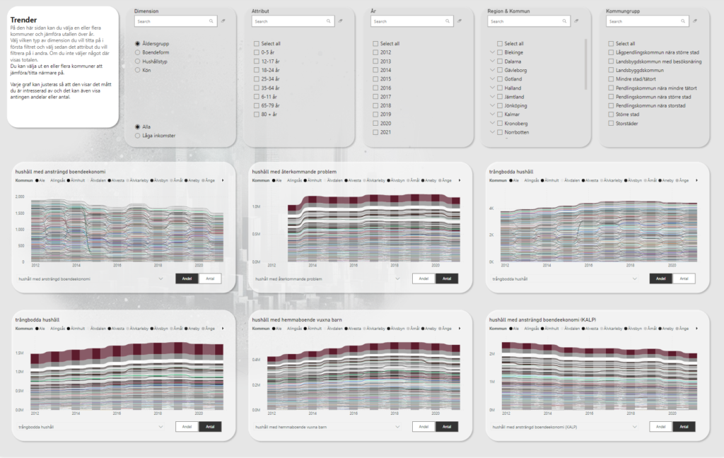
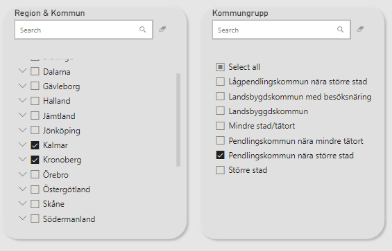
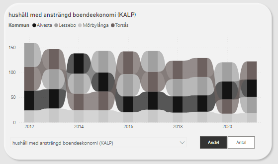
Let’s say we select “Pendlingskommun nära större stad” and then 2 regions, Kalmar and Kronoberg. This combination gives us 4 municipalities. Alvesta, Lessebo, Mörbylånga and Torsås.
The graphs looks a bit better now. Note that there are 9 graphs on this page. Each of them is customizable though!
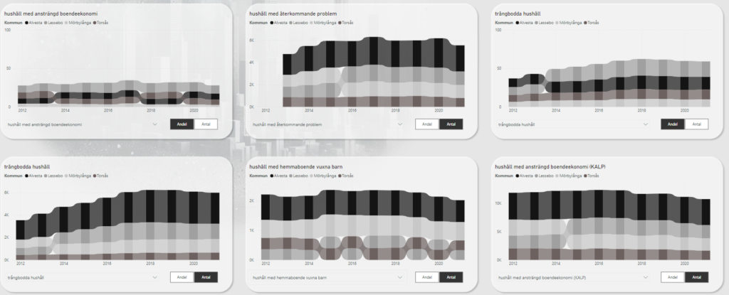
Under each graph, you select what measure the graph should show and if it’s amounts of shares.
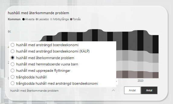
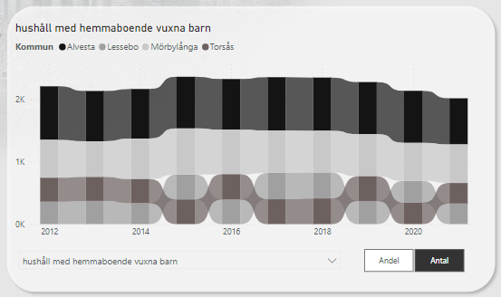
The graph is a “ribbon chart”. It’ll always stack the municipalities based on that years value. Here we see that Lessebo and Torsås kind of goes back and forth on who has the most households with grown up children living there.
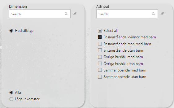
Selecting the dimension of “Single mothers” tells us this trend for households with strained economy.
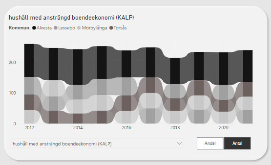
Alvesta is clearly on top, but that’s probably because of their larger population, right? Let’s change amount to share and see what happens:
We’ve created a new trend chart with very different results! My hopes is that even if you find chart making in Excel difficult, you will be able to make insights using this graph creator page of the Power BI report!
Jämför mellan kommuner
Again with the scary amount of numbers and clutter! My bad. I promise it will be clearer when we apply some filters.
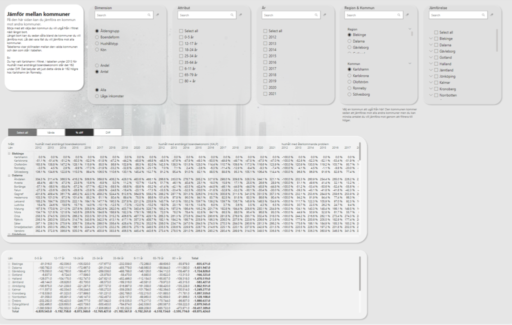
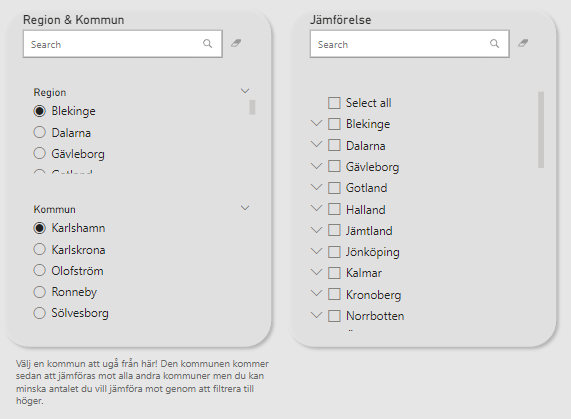
This time, you need to make one, and only one, selection of municipality. After that, you cannot select the type of municipality on the right filter, but rather you filter down the ones you wish to include in your comparison. The report page needs a selection, so by default it shows Karlshamn as it is the first item of the first region.
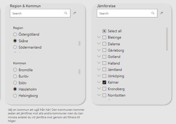
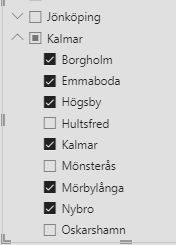
Let’s instead say that we want to compare Hässleholm in Skåne to every municipality in Kalmar.
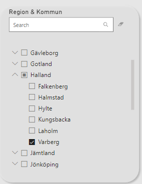
(Side note. You could deselect municipalities by clicking the small arrow on the side of the region name)
This time, each measure is a column name with the years underneath. The comparing municipalities are on the rows and each cell represents the % of difference between Hässleholms value and the item on the row.
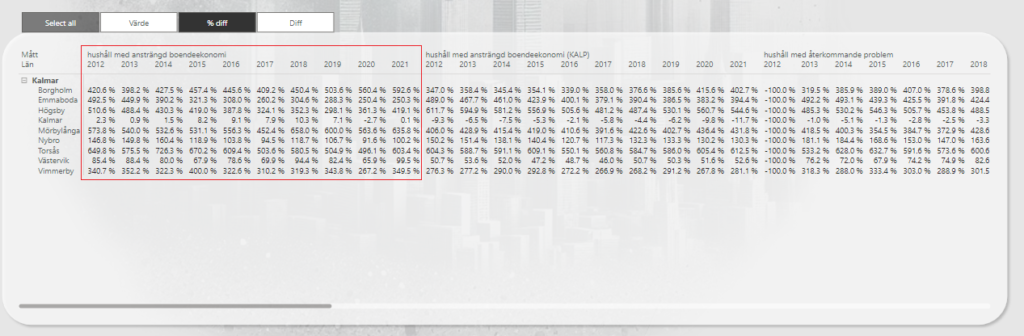
OK but what if 352% doesn’t tell you enough? I mean sure, I can see it’s a much larger but I want more data!
You can use the buttons over the table to include or exclude values in the matrix! By default, it only shows the difference in percentages but you can add the value for the compared municipality as well as the total difference amount.
Selecting all values gives you more insight, yes, but you will now have to scroll pretty far to get through all the data 😉
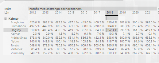
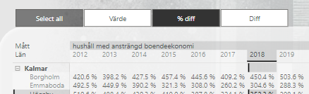
The matrix in the bottom of this page shows the comparing values over the attributes instead of each measure and year. By selecting a different dimension, you will change the column names of this table accordingly. You can also make selections in the matrix above to filter the matrix below. You might for example click on 2015 for a specific measure and voilà, you now have these metrics available over each attribute! Did you find something weird while clicking around? Perhaps a certain age group stands out? Now you can select that in the filter on top of the page and the upper matrix will be showing each measure and year but only for that age group.
Förändring över år
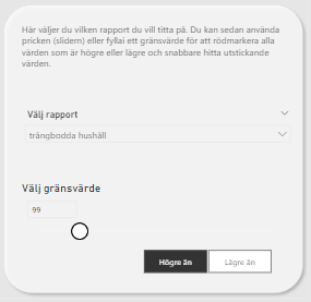
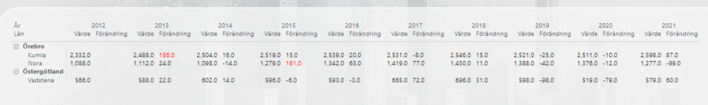
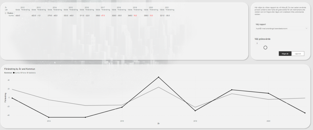
This page is made to simplify comparisons year over year within the same municipality. Just as before, you filter one or more items from the top. On the right side you select the measure/report you wish to dive deeper into and you can also set thresholds for highlighting values. I’ve selected Nora, Kumla and Vadstena in this sample.
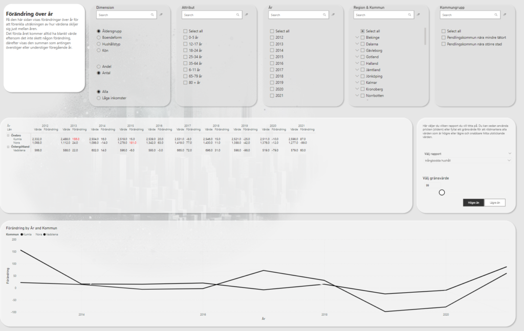
I’ve set the threshold to highlight all values above 99 and we’re looking at crowded housings.
The table shows each municipality, the value for a specific year and then the change from previous year. Naturally, the first year, in this case 2012, will have a blank change. For Kumla, we had 2 332 crowded housings in 2012 while in 2013 we had 2 488. 2488 – 2332 = 156. We can see that the amount of crowded housings for Kumla increased by 156 from 2012 to 2013. Since we also highlight all values above 99, it’s red.
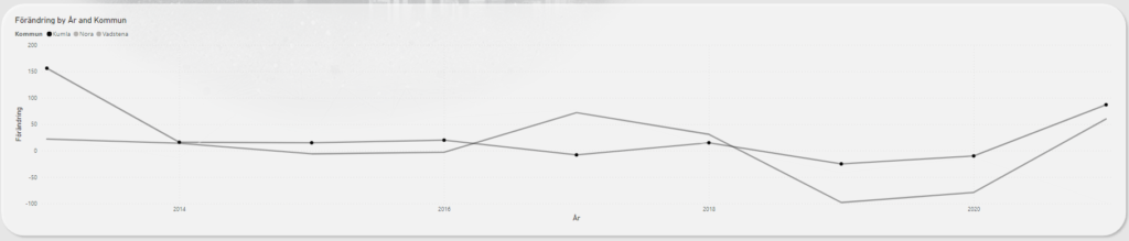
If you prefer to have a visual representation of the difference between years, you can look at the graph at the bottom. I’ve selected Kumla in the legend to get the data points highlighted in the graph.
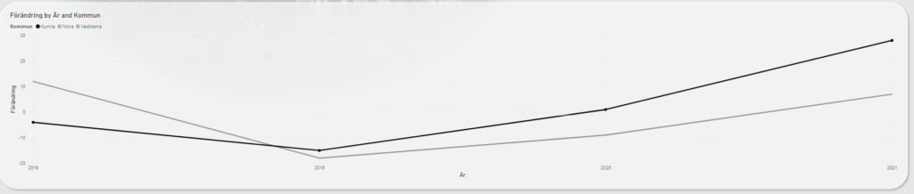
If I for example combine some slicers to select only renting in apartments 2018-2021 like this:
We can see that we have an increasing trend!
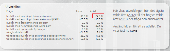
I we instead clear all those filters and look at the report for households with a strained economy, not only do we only see 3 years with an increase from the previous year but we can also see that in 2012 the amount was 424 while in 2021 there was more than 100 fewer! Good job Kumla!
They had 424 back in 2012. They had 321 in 2021. That’s a difference of -103.
-103 / 424 = -24.3%
So what we’re seeing is that Kumla have decreased households with a strained economy by -24.3% from 2012 to 2021! Neat!
Now if you wanted to see this a little bit faster, remember that these metrics are also presented and pre-calculated on the Översikt-page! This means that you can use the overview on the first page to play around with filters and when you find percentages that sticks out you can drill down further into the details on the change over year-page!
Feel free to make improvements to this report as you’d like and if you make any insights by using it, consider sharing those insights with other municipalities as well!
Cheers!