DAX magic with Selectedvalue
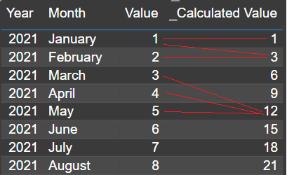
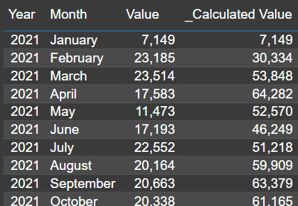
I was recently asked to make a calculation in Power BI and I figured this will make a good blog post for others to learn from as well. OK so the idea is that we have a table with values over dates. We want to accumulate these values by going 3 months back from the current month of the table.
That means, you look at the row for June of 2022, it should show the accumulated value of April, May and June together. On the next row, where we naturally will find July, the values must be accumulated from May, June and July and so on.
Every measure is always calculated in it’s context, so this means you need to provide the context for the measure to be evaluated in. Year and month are important so we want to calculate this measure based on the current combination of those, but we don’t want to use SUMX or AVERAGEX unless we also want to get a total value in the end.
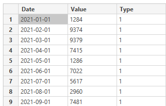
But let’s begin with the data. I have 2 tables in this sample. One is my facts table that looks like this:
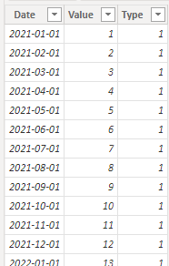
(At 24 rows, it restarts the date and changes type to 2. The value is set to 25 and keeps adding +1 for each row).
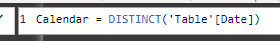
From the facts table, I’ve created a date table like this:
Now let’s have a look at the DAX magic!
This is not the final DAX query but I wanted to create it step by step for a better explanation of what it does.
_Calculated Value =

CALCULATE(
    SUM('Table'[Value]),
    ALLSELECTED('Table'),
    'Table'[Date] <= SELECTEDVALUE('Table'[Date]),
    'Table'[Date] >= EOMONTH(SELECTEDVALUE('Table'[Date]),-3)+1
)
It kind of obviously sums up the Value column in my table, right. The ALLSELECT-filter will allow the measure to be aware of all the other values in the same context though! That means that if I put this measure on a simple table visual, it will actually sum the total on each row. If I would’ve put in an ALL-filter, it would also include rows filtered out of my visual table though.
This is follow by my two SELECTVALUE filters. The first state that I only wish to summarize everything lower than my current value and the other state that I want everything higher than the last day 3 month back +1 day, essentially meaning the 1st day of 2 month back.
Using SELECTEDVALUE, I tell the measure of the context it’s currently in. This means that when it’s evaluated it will be aware of the context, as long as that context includes one selected value of my date.
Voilá! Works like a charm!
But let’s improve the measure a little but. We’re using the same selected date 2 times, so let’s make that a variable in the beginning.
_Calculated Value =
VAR CurrentDate = SELECTEDVALUE('Table'[Date])
Return

CALCULATE(
    SUM('Table'[Value]),
    ALLSELECTED('Table'),
    'Table'[Date] <= CurrentDate,
    'Table'[Date] >= EOMONTH(CurrentDate,-3)+1
)
This looks pretty good! But hey, let’s improve this just one more step for our users! What if they suddenly want to accumultate 4 months? What about 6?
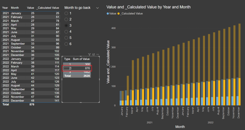
This looks like a job for a What-If scenario slicer!
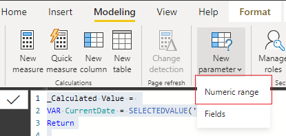
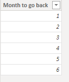
Just add a table with the amount of months your users should be able to choose from. I went with 6 month like this:
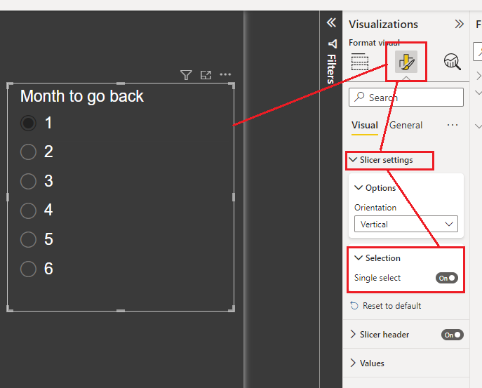
Create a slicer on the page and make it single select, like this:
In the DAX Query, add a new parameter for the selected month value
This time, we’ll gather the context of the selected value from outside the table. Since you only select one value in the month table, we’ll get that number here. Multiplying it by -1 will revert the number from positive to negative so that the end user have a nicer view of selecting positive number of months to go back while it’s still being calculated correctly.
_Calculated Value =
VAR CurrentDate = SELECTEDVALUE('Table'[Date])
VAR MonthToGoBack = SELECTEDVALUE(MonthFilter[Month to go back])*-1
Return
CALCULATE(
SUM('Table'[Value]),
ALLSELECTED('Table'),
'Table'[Date] <= CurrentDate,
'Table'[Date] >= EOMONTH(CurrentDate,MonthToGoBack)+1
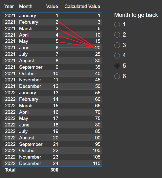
)We can now control the amount of months to go back! How cool is this?
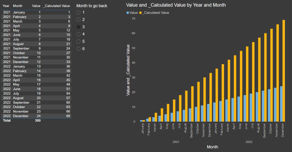
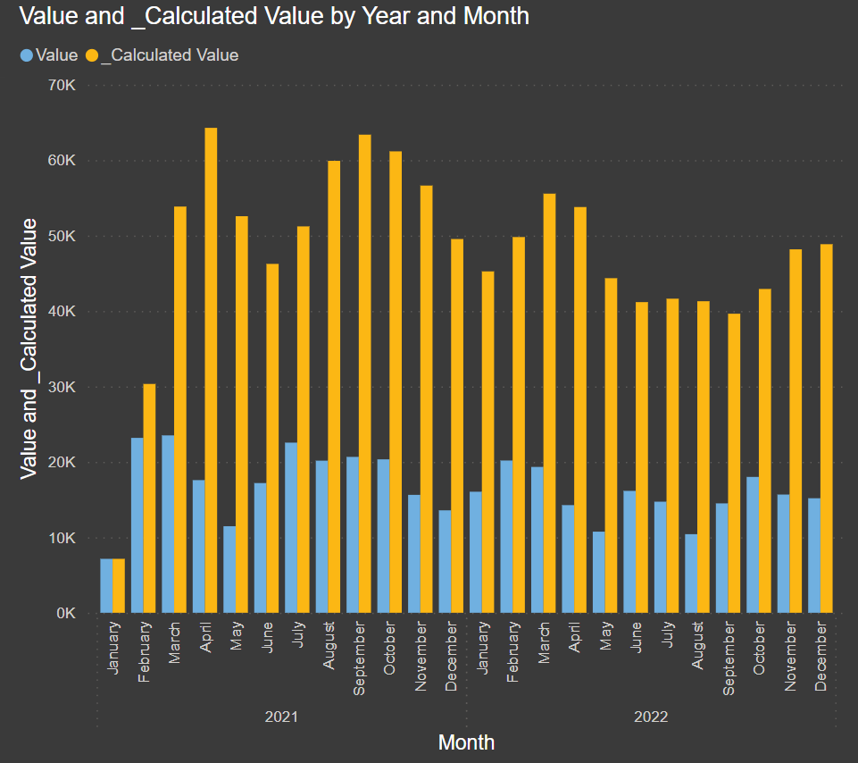
This type of information makes for a pretty neat graph as well
But wait a minute! I added a type column before. We haven’t looked at that yet!
I’ve added a table here that just summarize value based on type
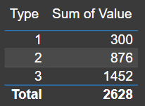
Type 1 is 1 + 2+ 3 + 4…
Type 2 is 25 + 26 + 27…
Type 3 is 49 + 50 + 51…
Since it’s a measure and it it’s still calculated in its context, you can freely interact with it like this!
This is pretty awesome actually. Imagine type being a useful dimension like department, brand, company name or whatever.
Oh and these numbers where easy. Let’s try with random numbers on each row between 1 000 to 9 999 😉
Now imagine trying to calculate this quickly in your head
Or imagining the visual representation of these numbers in a graph (!)
I really hope you got some good ideas yourself on what you could use the SELECTEDVALUE Filtering option for and also that you feel inspired to start using What-If slicers in your reports! They’re a great way to enhance the experience for your users and give them much more freedom!
It could be used to select dates, set thresholds, play around with percentages for calculations and much more!
For more inspiration on that matter, consider visiting these 2 posts:
Good luck out there! Cheers!