Groups in Power BI
Ever heard that less is more? You can’t see the forest due to all the trees? This happens in Power BI all the time and fortunately there is this great solution called grouping! This is a short post about the feature and 2 examples where I like to use grouping; Time and Space!
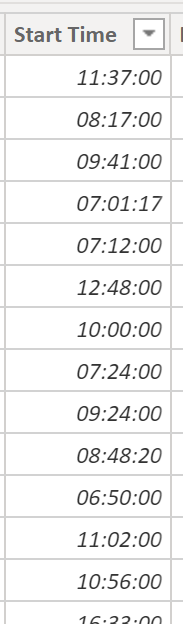
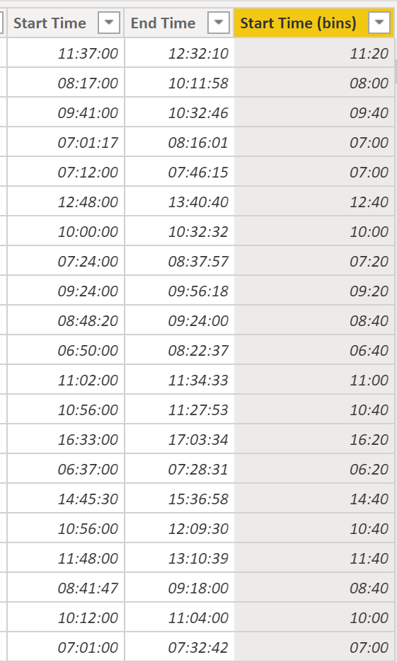
Let’s start with time. Here I have a data table with about 2,9 million traffic accidents in the US. This column states the exact time when the accident happened.
Very detailed to be sure, but when I make an area chart with this time as the axis and amount of incidents as the value, it looks like this:
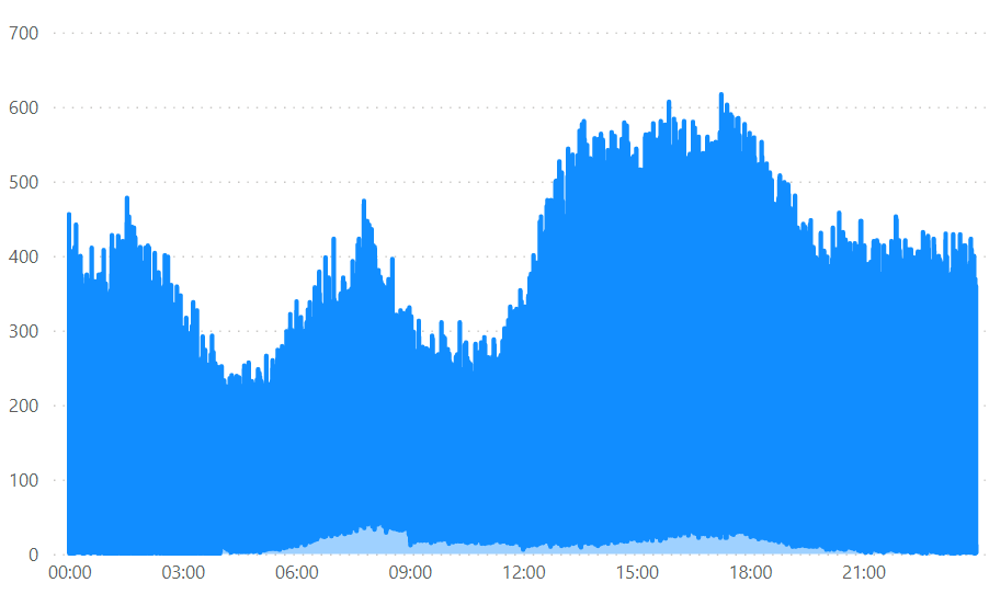
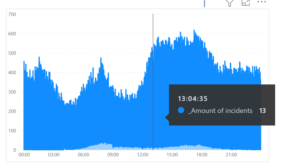
It’s really messy and the graph doesn’t even show all the data points as they are to many. While it’s impressive to see that 13 accidents happened at exactly 13:04:35 (on the second), it’s not very useful to the human eye. We can kind of see a trend here but that’s about it.
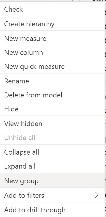
Introducing group! Simply right click on the field you want to group, in my case “Start Time” and select New Group.
The window should look something like this. Since Power BI already know that the column contains time, it suggests a group of bins where each bin is 5 minutes. I changed this into 20.

When clicking OK, Power BI creates a new column in my dataset where it bins each start time to the closest 20 minutes rounding. My new column will have full time, 20 minutes past and 40 minutes past any hour.
I’m starting to see the forest!
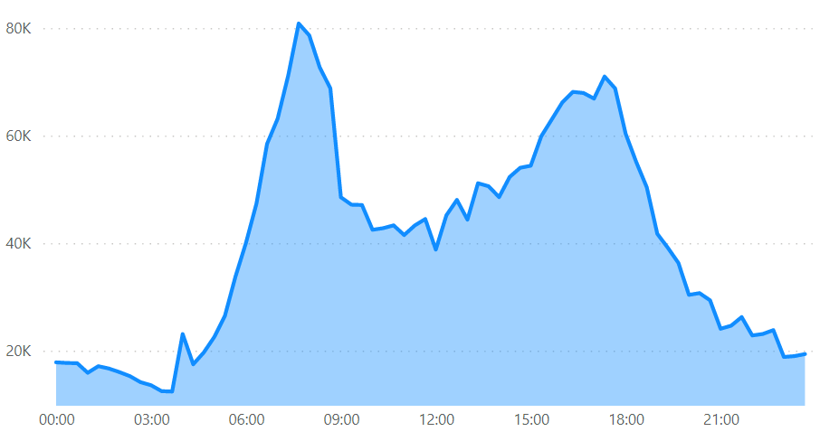
The beauty is that we can now edit our group and set 20 minutes to 60 (or 1 hour) and the axis for our diagram is recalculated into this:
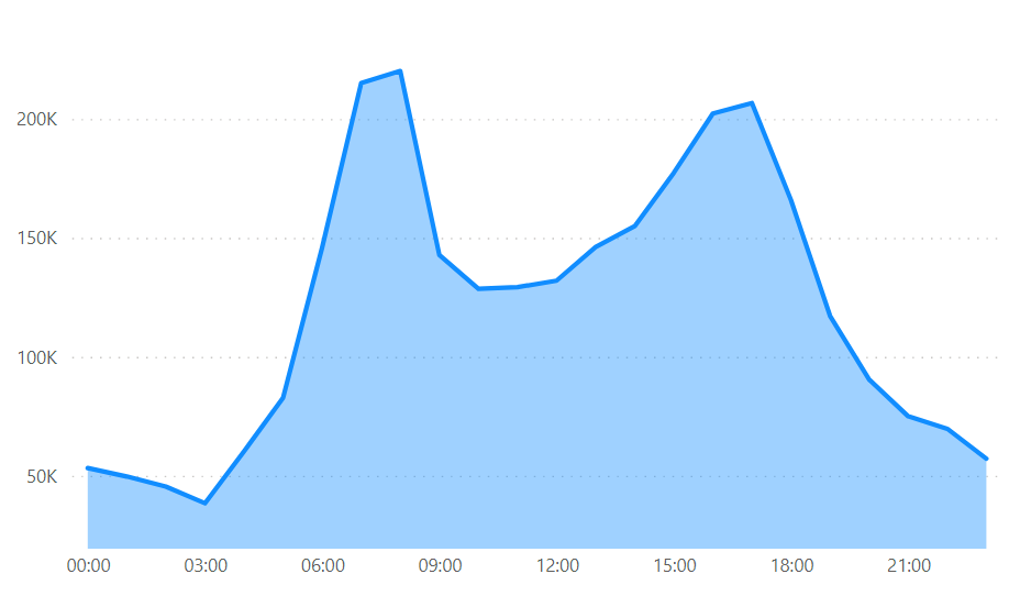
Grouping time is really useful when we want to see trends but mainly when we want to take the Y Axis into account for our analysis. Compare the last 2 images. Roughly the same shape but the first one is more detailed. It also peaks at 80 000 accidents. On the lower one we’re just above 200 000 for each point on the X axis.
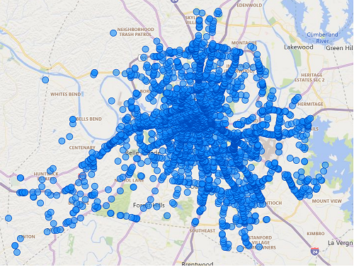
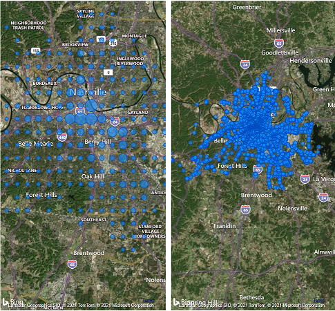
All right so the next thing I like to group is Space. To be more specific, longitude and latitude. In the same dataset, I have the exact place of each 2,9 million accidents. That’s way to many to make any sense of. It looks cool on a heat map, but each dot wouldn’t even show up on a map if I visualized it. As an example, this is Nashville:
We can make it more clear by filtering out the street with most accidents. Looks better, but there are still a lot of trees blocking the view of the forest here. Less would actually be more.

A snapshot from the dataset currently filtered looks like this. I’ve filtered this street in Nashville and I’m focusing on the place in space where the accident started. We can see that the number usually has at least 5 digits that we can round by using groups.

(On the next print outs I’ve simply named then Longitude and Latitude). First, let’s group these columns like this. I’ve set the bins to 0,015 but you will of course need to find your sweet spot based on how close you want to zoom in for example.

Friend of order would probably want to stop here. “Hey, Ville you idiot.. This ruins the data. The whole point is to know where the accident happened on the road and with this rounding, many spots are not even on the road anymore”. This so called friend would be correct. Our map now looks like this:

So why do I want this? Well this is like a drill down filter. It’s just one step of the way! We’ll simply add another map on the right side that isn’t grouped, but shows the exact spots of accidents.
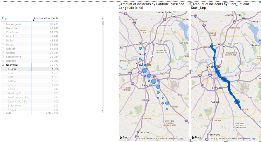
When holding down the CTRL key and selecting one of the bigger dots on the first map, all the dots making up that area is shown in it’s correct spot on the right map:
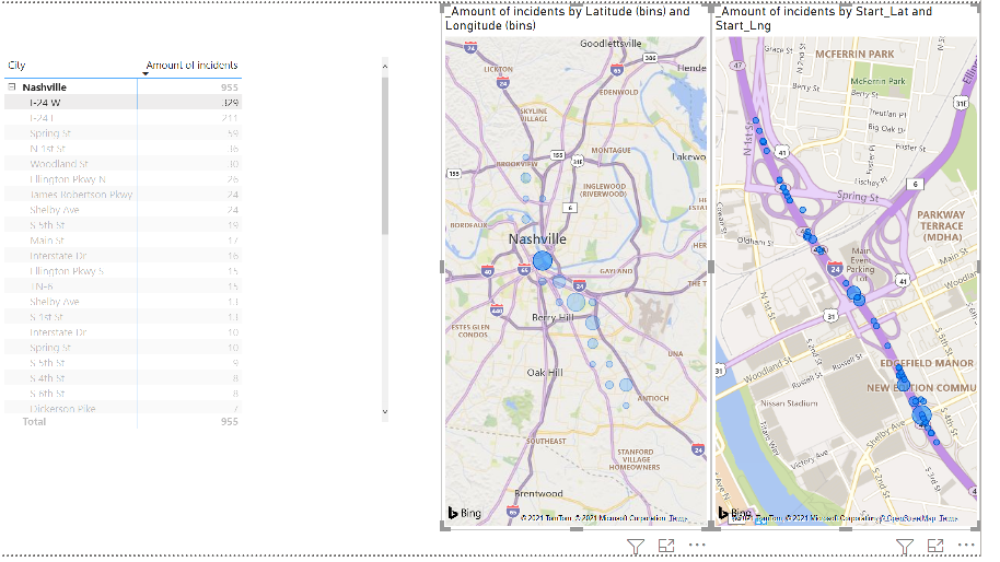
I kind of like the web-ish feeling this gives as well:
So there we have it! This is how we can use groups in Power BI for Space and Time! Now I’m heading back into reading “Short answers to big questions” by Stephen Hawking.
Cheers!