How to combine a clustered and stacked chart in Power BI
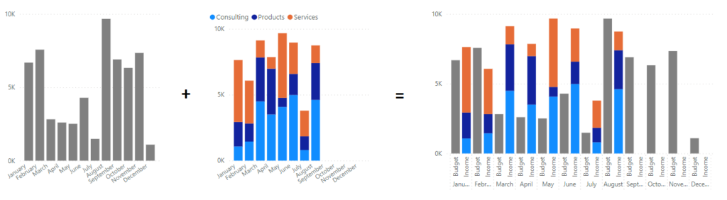
Let’s say you have a total budget, you want to compare it to your 3 income streams and you want to merge the diagrams below into one. Clearly it’s possible (I haven’t made the final diagram in paint you know) and here’s how it’s done!
The issue
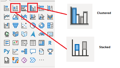
In Power BI, there are these 2 types of bar charts that are very commonly used. One is called a stacked bar chart since the values are stacked on top of each other and the other one is called clustered where you get the values next to each other.
Let’s say you sell stuff and have 3 categories. Using a Stacked chart, it’s easier to see how much they all add up to on a given month, but using a clustered chart will make it much easier to see how the different income categories compare to each other.
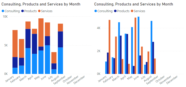
On the left one, I can quickly see that we reach almost 10K in May, but it’s hard to see if Consulting or Services had the biggest impact. On the right side, I can much easier see the different and that Services amounted for more than Consulting in May.
Now let’s bring Budget into the mix shall we?
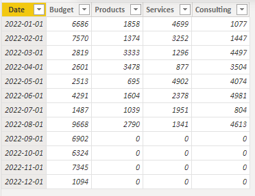
Since my data looks like this, let’s first create a measure that simply combines our income streams into one measure.
The measure, for the sake of this blog post, simply adds the columns together like this:

I’m using a clustered chart to show how the budget and the actual outcome compare month by month and it’s now easy to see our result.
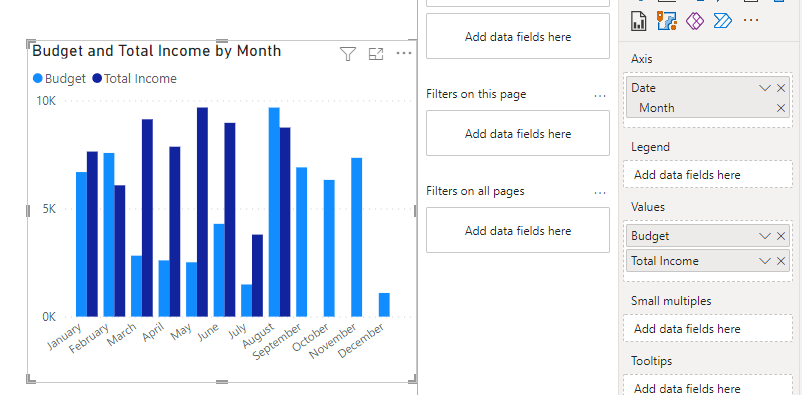
So far so good but the headline clearly says issue and so far, we’re doing great!
Here it is. If you have a stacked column chart and you add the Budget value, it’s going to be stacked. Duh..
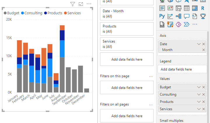
This doesn’t help us at all!
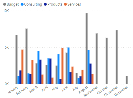
Making it a clustered chart isn’t the solution, we only want the Budget and the rest of the incomes to be separated. This is the same graph as above, except clustered.
The solution I’ve made (and I’m 100% sure there are much better ones out there so feel free to keep searching or use my solution as a base to improve upon) is actually just a Stacked column chart, but I make us of the X axis to separate the budget from the income. Here’s how it’s done!
The solution
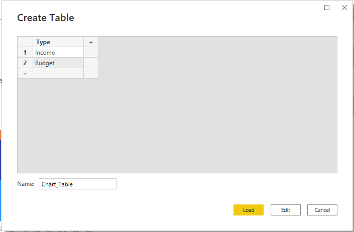
Introducing the chart table! It’s manually added data to a table with just 1 column. The rows are my category names. I called them Types here for some reason.
In my new table, I created 1 measure per column of values, like this:
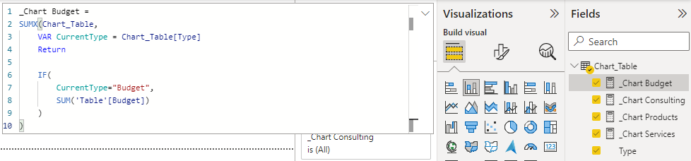
_Chart Budget =
SUMX(Chart_Table,
    VAR CurrentType = Chart_Table[Type]
    Return

    IF(
        CurrentType="Budget",
        SUM('Table'[Budget])
    )
)
All the measures are the same except for this part
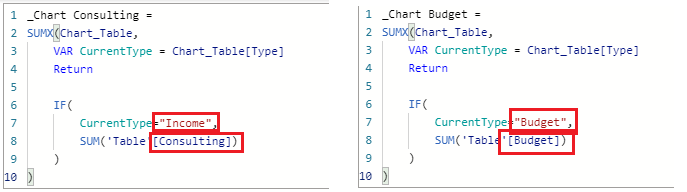
For product, Services and Consulting I sum the column if I’m currently on the row named Income and for the Budget, the row must be budget.
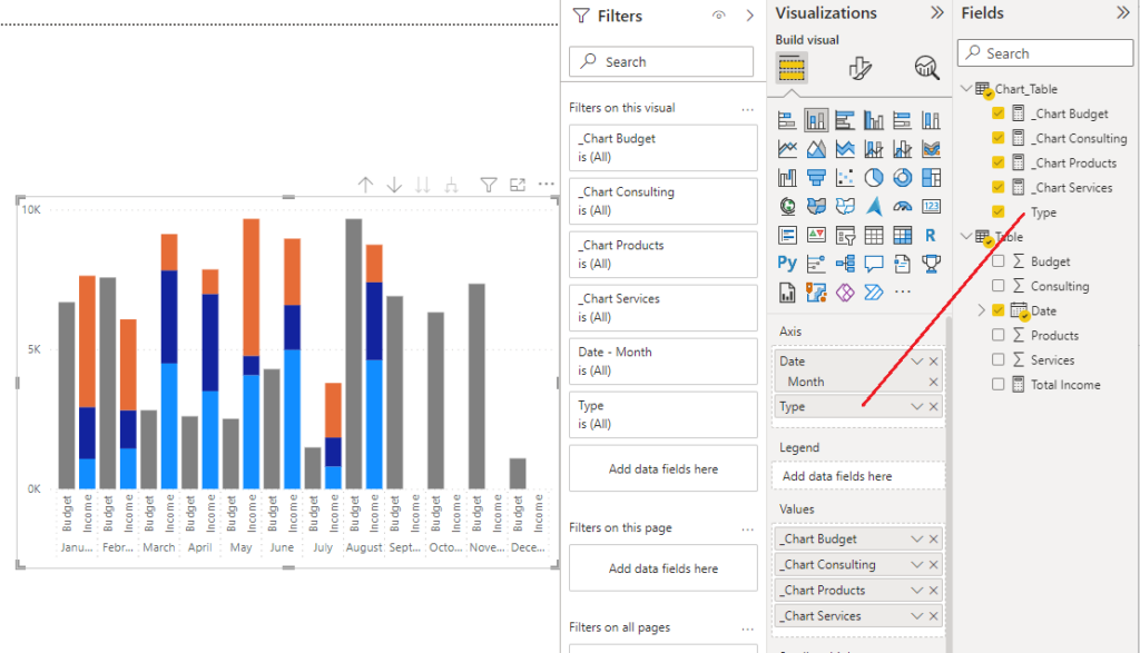
Finally, create you stacked column chart but add Type as the lowest level of the Axis. Make sure you show all levels of the chart. Since there is no relationship between the 2 tables, Power BI will add the row values to each axis over and over (which is what we want). When the budget is calculated it will skip the axis that says Income and vice versa. This gives us the outcome we want!
If you prefer, you can download this sample report from github here!
If you make improvements or have any kind of questions, feel free to reach out to me at https://twitter.com/Villezekeviking or https://www.linkedin.com/in/ville-gullstrand-mvp-b355067a/
Cheers!
Thank you!!! I was able to use your solution and put in a few tweaks to accommodate our requirements.
this is an excellent solution, do you think it is possible to not show both labels at the botom ? let’s say i only want to show the month label.
I suspect you could just make the labels by using 1 and 2 spaces. They would appear but barely be noticable 🙂
Excellent solution. However, since the 2022-May update, I am not able to get the dual-breakup provided by adding the “Type” field to the Axis.
Basically, only the 1st variable in the Axis/X-axis field is going to be considered. The rest will be ignored. ie, from your example, the “Date Month” variable will take effect (since it is at the top) but the “Type” variable would get ignored.
This should still work as from what I can see. It might be that you need to use the arrows that appear when hovering over the diagram in the right corner to drill down to the next level
Elegant and useful. Thanks!
Hey there! Is it possible to have your budget and income columns touching for each month?
Thank you!
A
One more, hopefully small, question- Is there a way to have Power BI show only 3 colors total? Budget always being gray, but income toggling dark blue and orange for every new entry?
What our goal is is to have all purchases for each of 20 GL codes compared to the budget for each month. One column may have 10 entries of different hardware purchases, and right now it looks like confetti visually.
That shouldn’t be any issue! Just sum up all of the GL codes as “Income” in the measure and it will make it so that it has the same color.
This would also respect filtering, meaning that the column with shrink if you deselect one or more of the GL Codes from a slicer for example.
Unfortunately not without all of them touching each other at this point.
Just remove the inner padding from X- axis
Dear Ville Gullstrands,
thanks for that amazing option! I could implement it for my purpose.
Now I’m trying to get some space between the months, so the columns withing the month are close to each other (good compareable), but the months themselves I would like to seperate a little more, do you have any experience with that?
Best regards, Bastian
Unfortunately the spacing applies to all columns in this diagram 🙁 I have not found a good solution for it just yet but I will update this post if I do stumble upon it!
Thanks for this solution.
About removing the space between Budget & Income and adding a space between months, in our case this is the workaround:
https://ibb.co/SxNh8Lx
– Adding a 3rd line in Chart_Table (” ” as text)
– Show items with no data
Hi can you show the formula? what mean by Adding a 3rd line in Chart_Table (” ” as text). Thank you.
I can’t find the text you’re referring to. “Adding a 3rd line in Chart_Table (” ” as text)” is not in the post, is it?
You can download the sample file from Github on the link in the bottom of the page to look at each formula 🙂 Does that help?
Hey please can you help me create this, I have followed all the steps and my chart is looking great, I just need to also make some space betweeen months. Thanks a lot
Sure thing! Select the column visual on the canvas, then click on “Format Visual” (the middle option under Visualizations), then go down to “Columns”, expand that and expand “Layout”.
Here you have an option called “Space between categories” that you can increase in %. Did I understand your need correctly?
No I mean, same as you have done at your workaround example (https://ibb.co/SxNh8Lx) by adding space between months. You have suggested to do this :
– Adding a 3rd line in Chart_Table (” ” as text)
– Show items with no data.
That’s what I need a little help with. Thank you
Just a nother quick question; would it be possible to even overlapp the columns withing a month like 30%?
And a last question: I have 3 colums at the momnent, 1 stacked, 2 unstacked, I would like to position the stacked one in the middle, but it stucks in the beginnen of each cluster (month), do you know if its possible to change that position?
Yes this should be possible using “Sort By”. By default the sorting is alphabetical but you can create a new column in the Chart_table where you create a number for each category. I would have used the SWITCH function for it.
When this order column is created, you select the Type column, head over to Column options and select “Sort By” and finally select your new number column.
This is super helpful. But how would one do this with a DirectQuery?
You should still be able to make a local table for your dimensions that would be in import mode of your Power BI Dataset even if you use DirectQuery for the other tables
BRILLIANT!!!!!!!
It worked like a wonder! We couldn’t import the appropriate custom visuals into our pbix so we almost gave up on the solution until I found this article. You are amazing, thank you for the golden knowledge share!!
It worked!! But how did you create relation between ‘Table’ and ‘Chart Table’?
That’s the thing. Since you are using SUMX you don’t use a relationsship between the tables.
On the downside, you’re not using the data model to make calculation faster but it does work 😉
This is exactly what I was looking, I tired so many things did not work.
Thank You x 1000
Hi,
when i try to drag the “TYPE” to X axis, i get an error message that can’t display the visual as there is no relationship between the tables. PLease advise. I have date in my Xaxis.
There shouldn’t be a relationship between the tables as this solution uses SUMX instead.
But you do however need relationships in the rest of your data model so make sure you are able to create charts without TYPE. When that works, including TYPE should also work.
I can’t get this to work, and I really want to! I’ve followed the steps, I’ve got my measures created correctly (my measures are slightly different, using COUNTX with a FILTER instead of SUM, because instead of having Consulting, Products and Services from different columns, I’ve got the text “Red”, “Amber”, “Green” from inside a single column). If I create a chart with everything *except* the ‘Type’ column I get a viable chart, and instead of having the two columns Budget and Income side by side (or for me, Last Month and This Month), the Red, Amber and Greens (x2) all show in one column, as you’d expect. As soon as I drag the ‘Type’ into the columns field, the columns on the chart all vanish. If I ‘show as table’, or change the visualisation to a table, there are no values showing against my measures, only totals. Has anyone got any idea why this is? Thanks.
I’ll reach out and we can continue this conversation and send some samples back and forth until we fix it for you 🙂
Thanks. Very shortly after submitting my post I worked out the answer (isn’t it always the way). Whilst trying to make it work I’d added a couple of relationships. I forgot to remove them when I fixed the thing I actually needed to fix (which was getting my measures to work – my data is set up a bit differently and I had tried using CALCULATE which it didn’t like, but I found an alternative way).
Dear Ville,
thanks, it works perfectly!
I would like to drill up or down now; this doesnt seem to work within that option. Because when I drill up I get a just stacked columns. I would like to keep the visual as it is and still be able to change the perspecte from months-view to a year-view.
Do you have any idea how to combine this chart with the option of drilling up or down?
Thanks a lot, Bastian
I have an idea for how this could actually work! Kind of.
My workaround for this would be to create a copy of the graph for each dimension you wish to visualize and then hide all of them except one. Create a bookmark for the one showing then go through each graph the same way, creating a bookmark where only one is showing and the rest is hidden. When done, I’d create a button for each bookmark and place above the graph so that you can select what graph to show. Each graph is the same size and have the same X and Y position, but since only one is showing at the time the end user will get the feeling that they are switching dimensions for the same graph.
Another solution would be to combine a lot of information in an unpivoted table and use a slicer to select one dimension at a time.
It sounds weird but have a look at this blogpost where I describe the method. It’s pretty far down, under the headline “Graphs”.
https://www.villezekeviking.com/trackmania-analyzer-part-1-using-the-report/
Brilliant! Thank you so much!
Hi this is a really great post! But what if instead of having one table, my budget and incurred and forecast values are measures in my data model?
You can use the same method but just call the measures in your SUMX over your category-table.
Where I have the expression for SUM, you just use your measure instead
How to remove space between two categories like in your case between budget and income, pls help i am new to power bi
Select the visual, then head over to the format pane. In there you’ll find bar settings and spacing
Amazin solution! Thank you
Thank you.
I can’t create table Type since I HAVE LIVE connection to my semantic model, is there a way to make it work without creating table and do everything in measure
Not that I know of. You need fields to add to the graph. Perhaps you can get them added in the main model?
This is an awesome solution for something that I would have assumed is such a basic requirement. I understand PowerBI has issues understanding what to cluster and not, but this really is an elegant solution to the issue
Thank you, still works in 2025
I’m impressed! One question if I may, but is it also possible to make the second column stacked? Like if I had subcategories to my Budget that I’d like to specify, for example.
Thank you very much!
Hm you should be able to make a nested SUMX, i.e. a SUMX inside another SUMX, to make that happen!