Trackmania Analyzer – Part 1 – Using the report
This blog post covers the usage of my Trackmania analyzer that you can find on GitHub, so feel free to make use of this if you want to analyze your own replays! Other parts cover more technical aspects of the report and these posts should be considered if you want to build on the Power BI report yourself! Note that I ran all these runs and just made up names to get demo data.
You can also click here to open a published demo report in the web and click around!
There are 4 pages in the report:
- Leaderboard
- Deep Dive
- 1 VS 1 Deep Dive
- Graphs
This is part 1 of 3. You can read the other posts here:
- https://www.villezekeviking.com/trackmania-analyzer-part-2-data-transformation/
- https://www.villezekeviking.com/trackmania-analyzer-part-3-calculations/
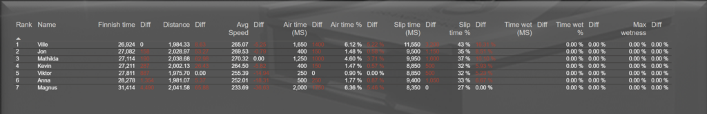
Leaderboard
This page is used to compare all the runs in one single place! Let’s say you’re a bunch a friends that have played the same track or maybe you hosted a championship at the office. This page will now show you all you need to know in order to make an overall insight of the runs.
This is the overall view of the entire page
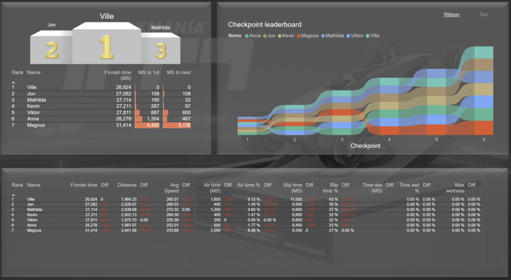
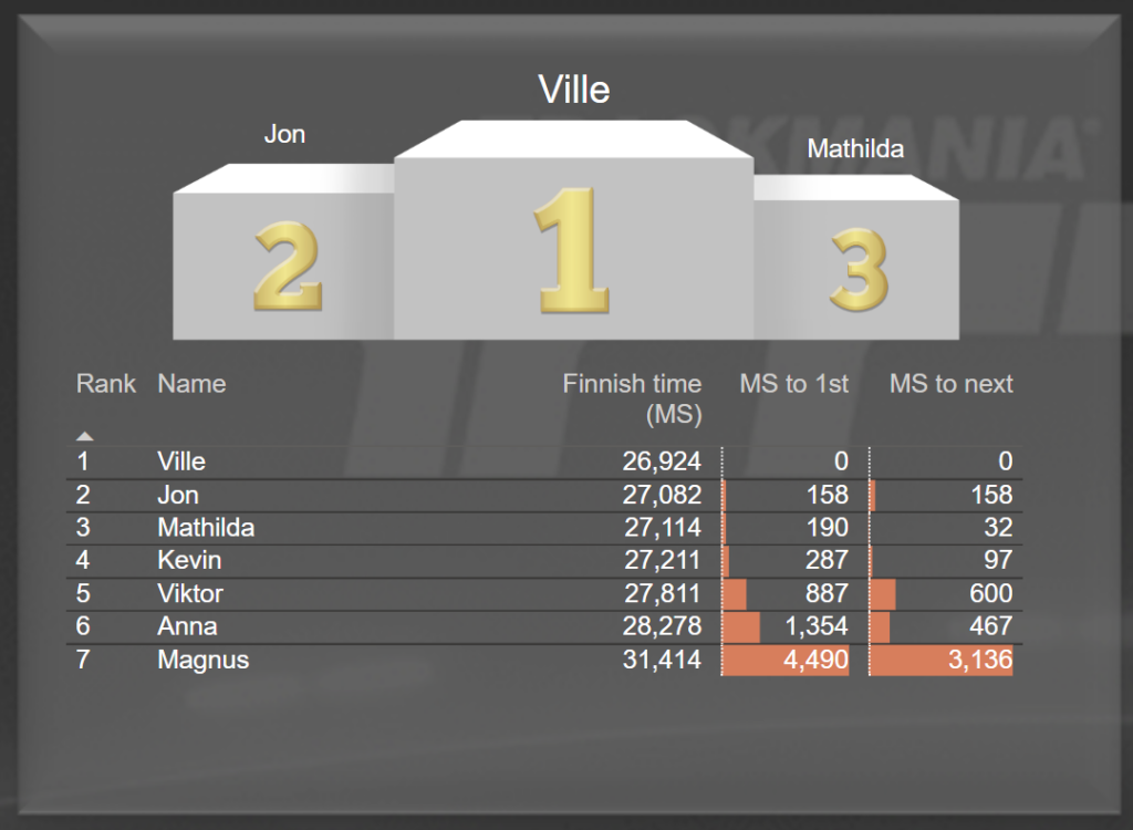
First we have the obvious trophy stand. Underneath you’ll find a bit more details, such as rank, the exact total number of milliseconds the run took and finally 2 measures that show how far behind you where, both first place but also if you want to get just one rank up!
Next up we have the ribbon chart! I really like ribbon charts and I rarely see them in reports. This is showing who had the best time at each section of the map based on the checkpoints. The higher up on the graph, the less time it took you there. Note that this is measuring the total amount on the track and not the time between each checkpoint.
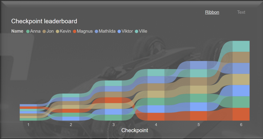
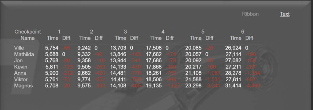
If you’re an accountant (I have some preconceived notions I need to work on) you might want to see the actual raw numbers here instead! Fear not! Up in the right corner you can toggle between the Ribbon and Text. Text will give a table of all the actual times as well as a handy little diff value for each checkpoint! If your diff is increasing for each checkpoint it means you are falling further and further behind and vice versa.
And on the same note, i.e. you want all the numbers, on the bottom of the page you have some values gathered from the sampling in the replay file! There are enormous amounts of data collected for each replay and this just shows some of that.
That’s the simple overview leaderboard. Next up we go deep!
Deep Dive
Next page is the deep dive of a single run. It looks like this!
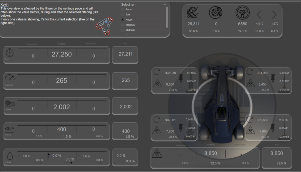
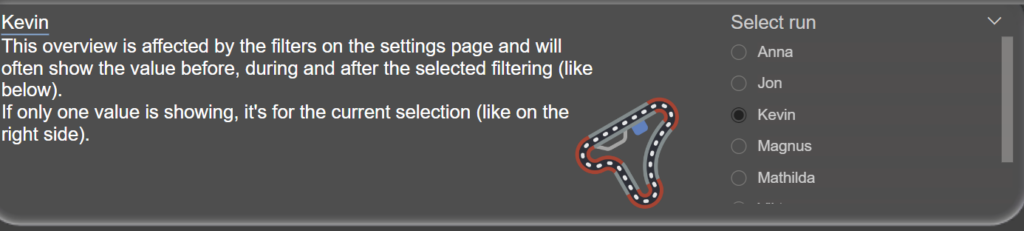
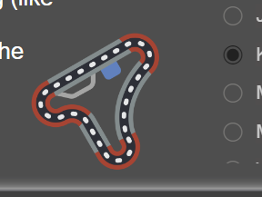
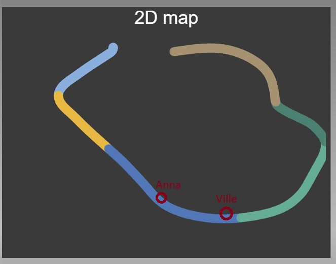
The page begins with a short description, an image of a map and a slicer to select the run you wish to deep dive into. You can only select 1 run at a time here.
The text is not only small but also blurry. This is because I’m terrible at UI. Anyhow, the first bubble there shows the time spent driving. On the right side, in the small bubble, is the total for the entire run. The reason they’re not the same is because the left bubble shows information based on 50 ms increments that is sampled in the ghost-section of the replay file. The amount of ms driven is therefore the amount of samples * 50. The total time on the right is however the actual amount of exact ms you drove.
So why are there 0 on the left and right side in the left bubble?
To answer the question above, simply click the Track icon I mentioned earler. (If you run this on Power BI Desktop you need to hold the CTRL key while clicking)
Behold as it is time to select the portion of the map you wish to analyze further! In this new window you can see the data points of the run on a 2D map to the left and the height in the graph on the right.
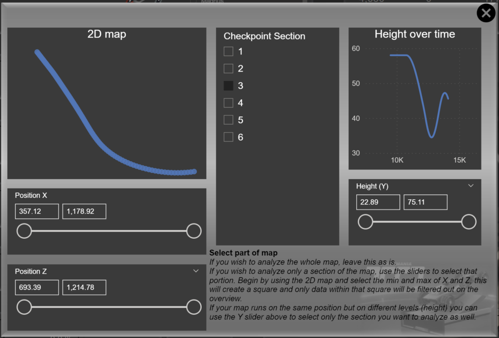
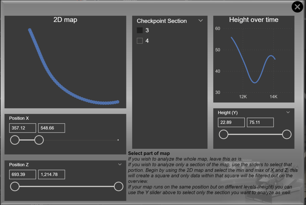
You can either use the slicers to create sort of a filtered square (or cube if you also filter Y) to go into the exact section you wish to analyze or you can click one or more Checkpoint sections.
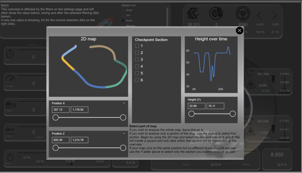
You can even combine them. Here I’ve selected checkpoint section 3 but also used the X slider to remove the straight line before the turn.
When you’re done, hit the X in the top right corner of the window to close it. Again, if you’re using Power BI Desktop you need to hold the CTRL key.
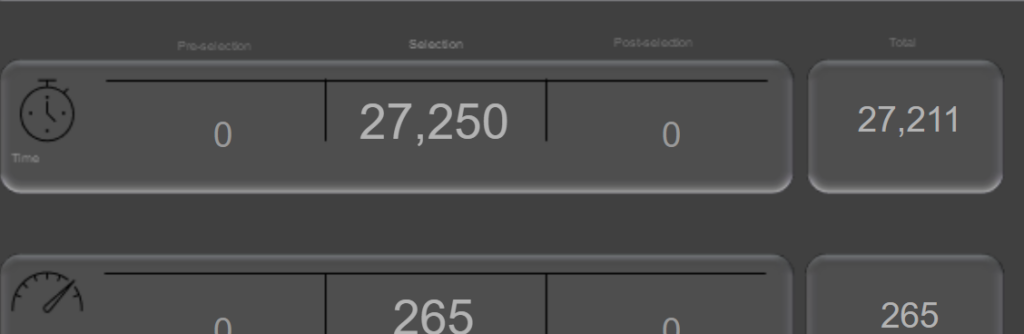
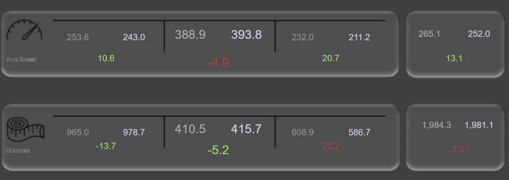
The visuals makes a little bit more sense now that they have values. The first value is summed up from all the datapoints that where captured before the section, the bigger value in the middle is the sum of the actual selection and on the right you have the sum after the selection.
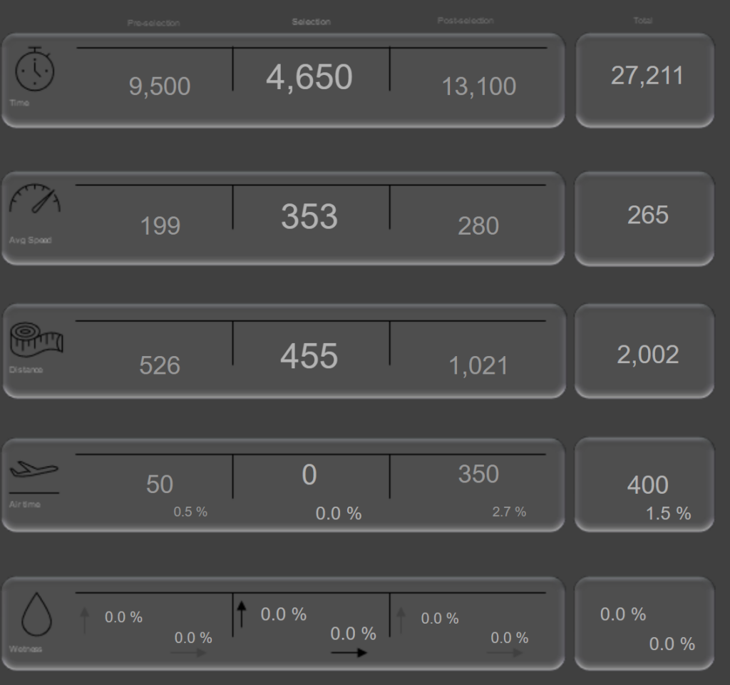
The sections show, from the top down:
- Time spent in selection (to closest 50 ms)
- The average speed
- The total distance*
- Time spent in the air (to closest 50 ms)
- Up arrow is max wetness value and right arrow shows time spent driving while wet
* Distance is actually not something that exists in the Trackmania data. I created this myself since I know each row is 50 ms and I know your speed at each record. Trackmania doesn’t use km/h, it simply uses “speed”. Due to this I decided to simply say “Distance” as well instead of for example km.
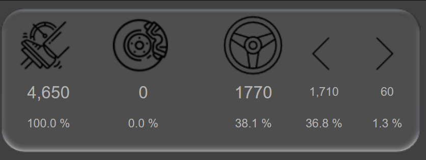
If you have a look at the top right you’ll find a bubble that only shows data from the section you made. This is the time you’ve spent throttling, braking and steering. Here the runner turned right for about 60 ms which is 1.3% of the time spent in this sample.
This data is actually rounded to 10 closest ms, not 50!
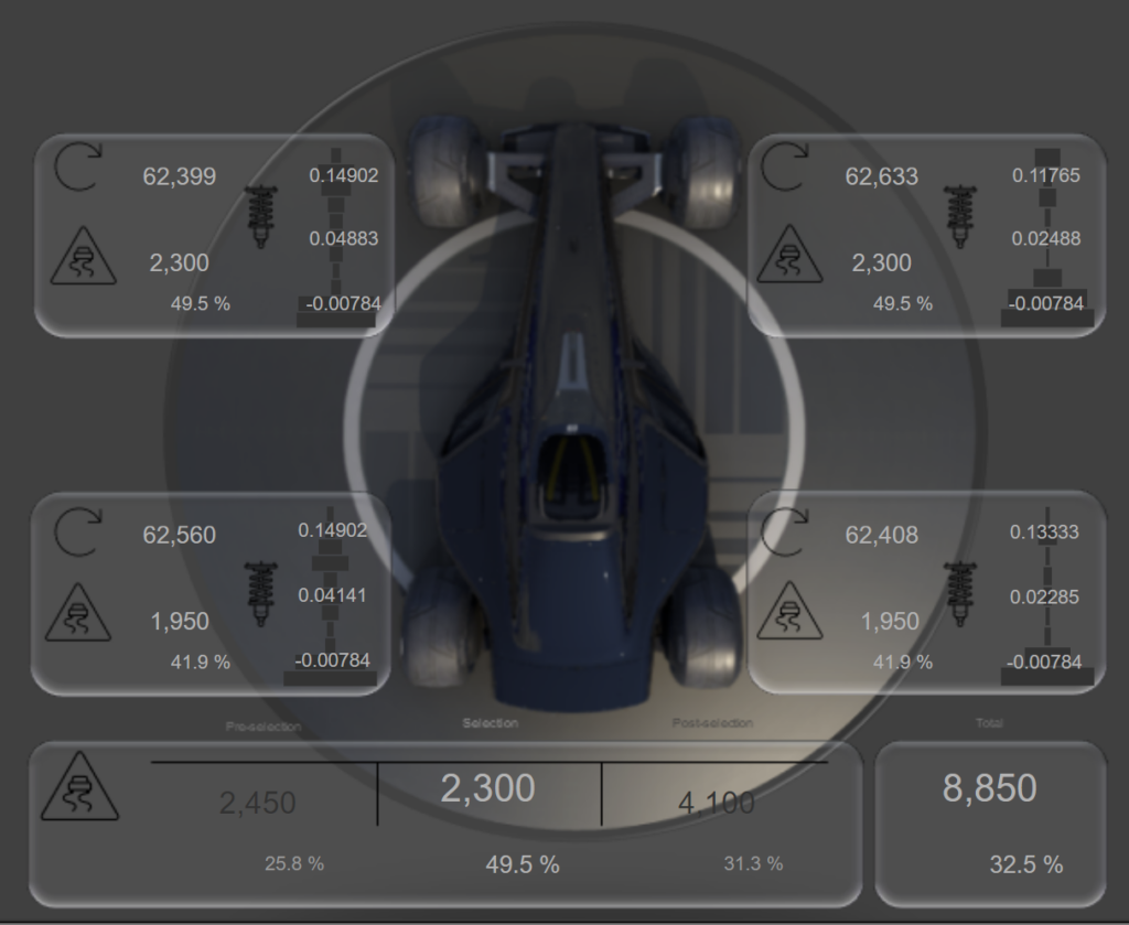
The next section show an overview of the wheels. Each bubble close to the tires represent information about that tire. These bubbles, just like above, only shows data captured in the selection on the map that you’ve made. Below the car you have values before and after the selection as well.
First value is the rotation that specific tire made during the sample.
Below this value is the amount of MS (closest 50) that this wheel was slipping as well as a % that shows the amount of slip time compared to the whole time spent in the sample. If you remember from the first image we spent 4 650 ms in this section and if the wheel was slipping 2 300 ms, it was slipping around 49,5% of the time.
In the right side of the tire-bubbles you have the damping value. First is the highest damping value, in the middle is the average and at the bottom is the lowest value each damper had during this section. If you look close you can also see a diagram behind the numbers that represent this a little bit more visual.
Finally at the bottom you have the total slip value, regardless of tire. Since not every wheel need to slip at the same time, this value could actually be bigger than the highest value of each tire.
At this point I know what you’re thinking. You’re thinking: “Is this is? Is this really all the numbers you’re able to squeeze in on a single Power BI page?”. Don’t worry, friend.
1 VS 1 Deep Dive
If you liked the Deep dive, but you want to compare 1 runs, look no further! Just as before, you select a portion of the map but in this page you have 2 slicers for the runs. Select a run in the left slicer for the left values, the right slicers for the right values and feast your eyes on the diff in the middle of each number.
Some values are green/red and others are grey. Green means better, red worse and for the grey ones I don’t really have an opinion. I can’t really tell if you did better or worse because you spent 150 ms less time steering left during this section, but driving a shorter distance is better just like a lower average speed is worse.
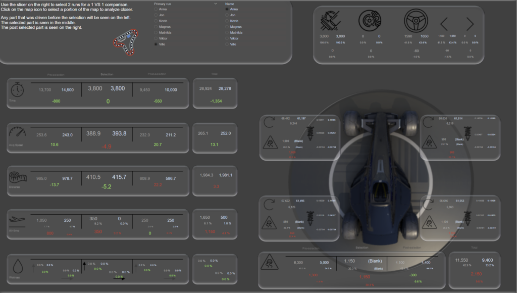
2 very important measures are the speed and distance. They are, by the end of the day, the 2 factors that determines who drives the track in the shortest amount of time. If you want to improve your time you can either drive at a higher average speed or a shorter distance. Balance is key here as in any racing. By increasing the speed you might not be able to make a turn as tight which means a wider angle and that means a longer driving distance. Keeping the car in the inside of the turn means shorter distance but might not be possible at higher speeds.
In this sample I’m comparing Ville to Anna (made up person). What we see is that during the section before the track filter, Ville was driving 253.6 speed on average while Anna was driving 243 speed. This is 10.6 average speed slower. In the selected section of the map, Anna was actually driving faster, on the section after the filter, Ville was once again faster. On the total track Ville drove 265.1 speed on average, 13.1 speed faster on average than Anna at 252.
In regards to distance, Ville drove a shorter distance both before and during the selection of the track, but longer distance after. On total, Ville actually drove a liiiiitle bit longer distance than Anna, but the higher average speed made it worth it.
Tired of all the numbers? Maybe you wish to rest your eyes on some visual graphs?
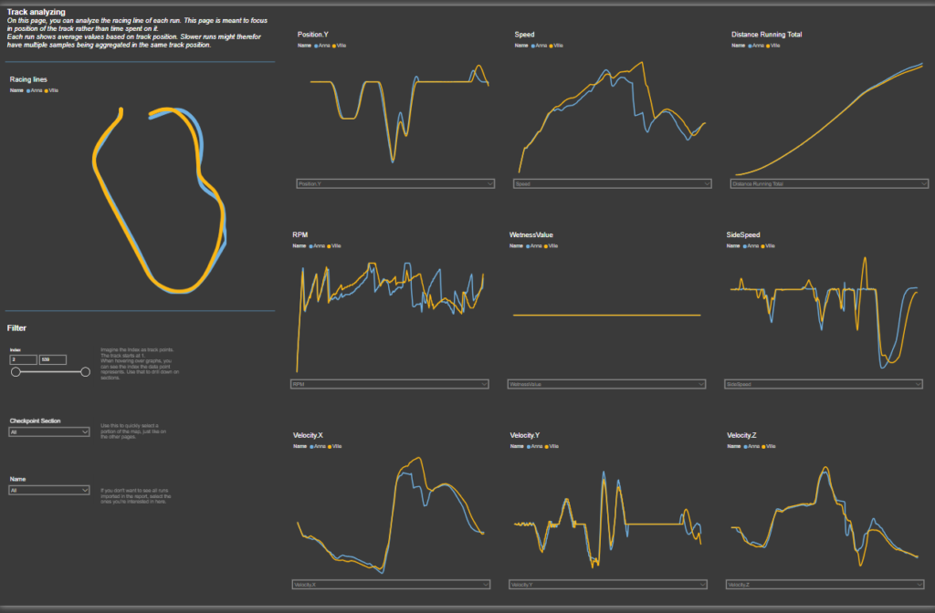
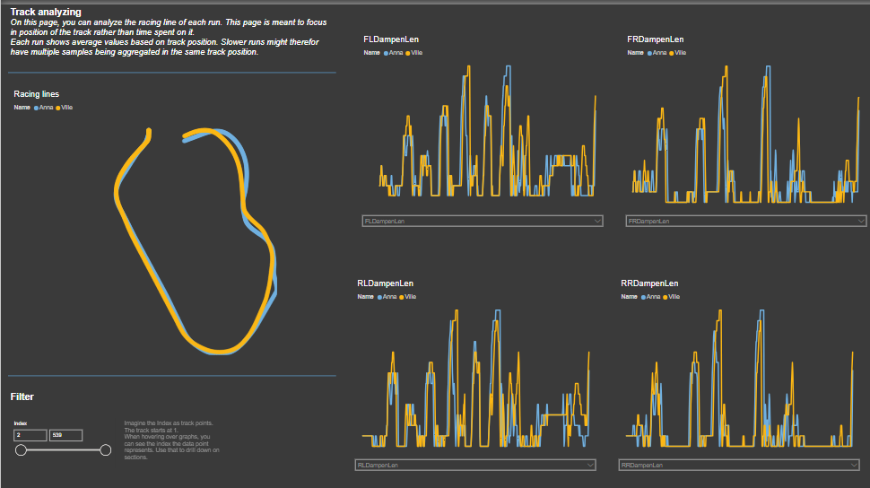
Graphs
The last page of the report has 9 graphs that you can customize on what to show from all the attributes in the entire Sample data (as long as the attribute consist of actual metrics, not true/false or text etc).
The page has a standard setup of these metrics, because they are what I suspect will be the most relevant.
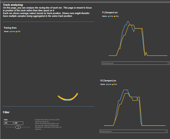
On this page, you use the index of the track to filter out sections. I might for example notice that Anna is losing speed compared to me around here. By hovering over that point I can see the index being 93.
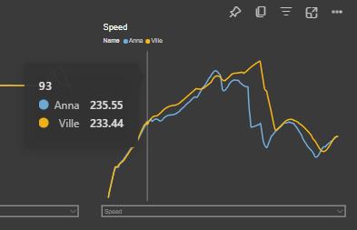
By filtering the index to, for example, 90 – 150 I can now look closer at that speed gap but note how everything else is also changing!
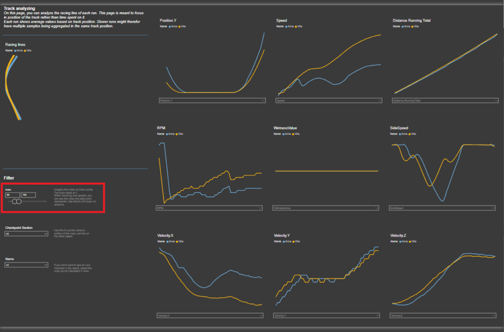
I could even go in even further. Only showing 90 – 95 (each index is representing 50 MS of the fastest run, so this is now showing approximately 0,25 seconds of driving)
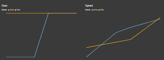
At this level I can visually see that Anna is accelerating slower due to a gear shift.
With the dropdown under each graph you can select what you want the graph to show! I could for example select the dampening of each tire like this:
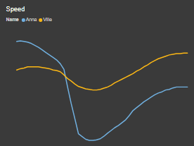
Zooming in on a left turn I can see that the left side of the car is heightened which makes sense. The G-force should put pressure onto the right side of the car in a left turn. It looks like Annas dampers are even higher than mine here though which I assume would mean she drives a bit more aggressive.
Looking at the speed curve for the same index as above, I can see that she came into that corner faster but lost a lot of speed while turning. Perhaps drifiting?
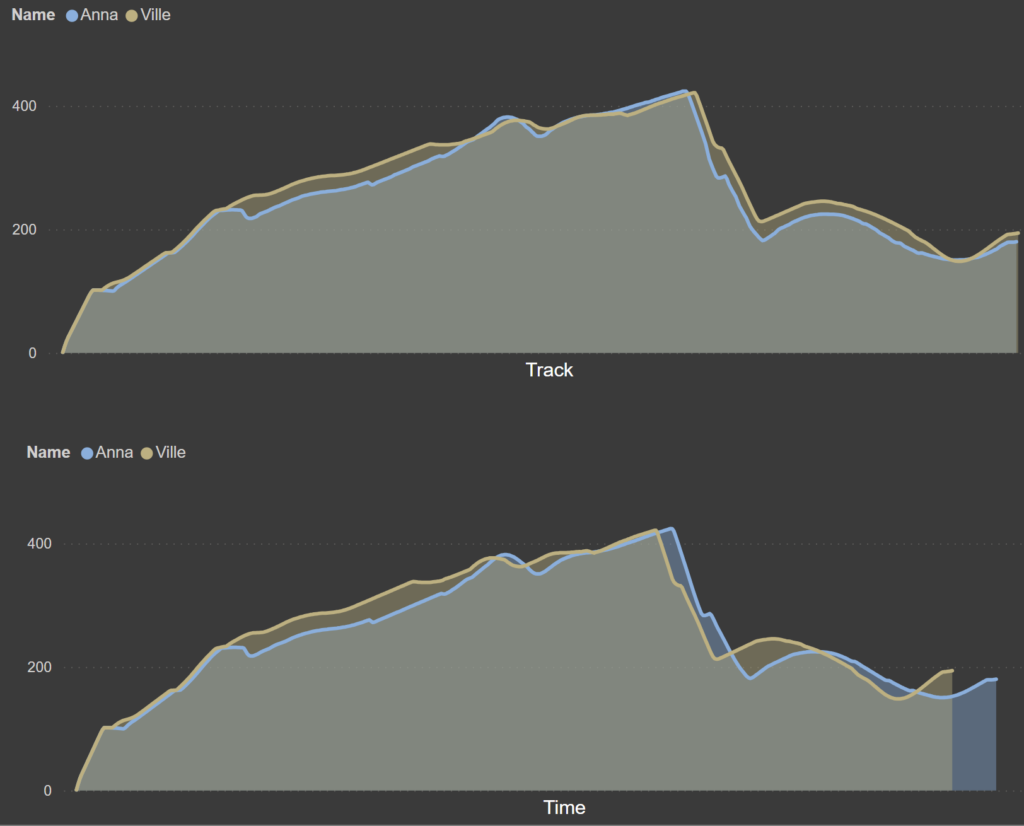
What’s interesting about these graphs is that the X axis represent space, not time. In Part 3 of this blog series I explain the nerdy calculations behind this but for now I’ll just explain it like this:
Since the drivers are on different locations on the track at different time, it doesn’t make sense to use time as the axis. Let’s say that Ville and Anna has both been driving for 15 seconds. Since I am so much more awesome at driving than my made up person Anna (who was actually also driven by me), we will be at 2 different locations after 15 seconds.
Comparing our average speed after 15 seconds makes not sense. It makes much more sense to compare the average speed when we where both at the same position on the map.
Here’s 2 graphs showing the average speed for Ville and Anna. The first is using the track (space) as X axis and the lower is using time spent driving.
I hope this report will bring you some insight but most importantly some fun!
If you have any questions or feedback, don’t hesitate to reach out!
Oh and of course credit where credit is due! I got a lot of help to better understand the sample data and the replay file structure from Adam, also known as Donadigo. You can find more information about him on this site! Check it out!
I also got a lot of help from Jon Jander, a long time friend of mine who developed the extraction solution used here. Apart from creating this software, he also proved to be great at bouncing ideas for lots of the calculations made.
Cheers!