Bayes theorem in Power BI
I’ve been following Veritasium on Youtube for some time. It’s made by Derek Muller who is really awesome att explaining science! Back in 2017 he made this video on Bayes Theorem and while looking through his older videos I stumbled upon it. It’s only 10 minutes long so you should be able to easily find the time to watch it.
I really recommend you heading over to his channel on youtube and work your way through the videos there if you haven’t already!
Anyhow, this gave me the idea of creating not only a calculator for Bayes theorem but also a built in simulator of outcomes! For my fellow Power BI nerds out there, this blog post will go through some tips and tricks such as formatting values, combining values and simulating outcomes. As usual, if you just want to jump straight into playing with the sample report, click here to open it in a new window or download it from my github to build upon it yourself!
This is the Bayes calculator!
First I’ll walk you through how to use it and further down in the blog post is the details on how I built it, so feel free to skip ahead if you’re one of those “looking under the hood”-types of people!
How to use it
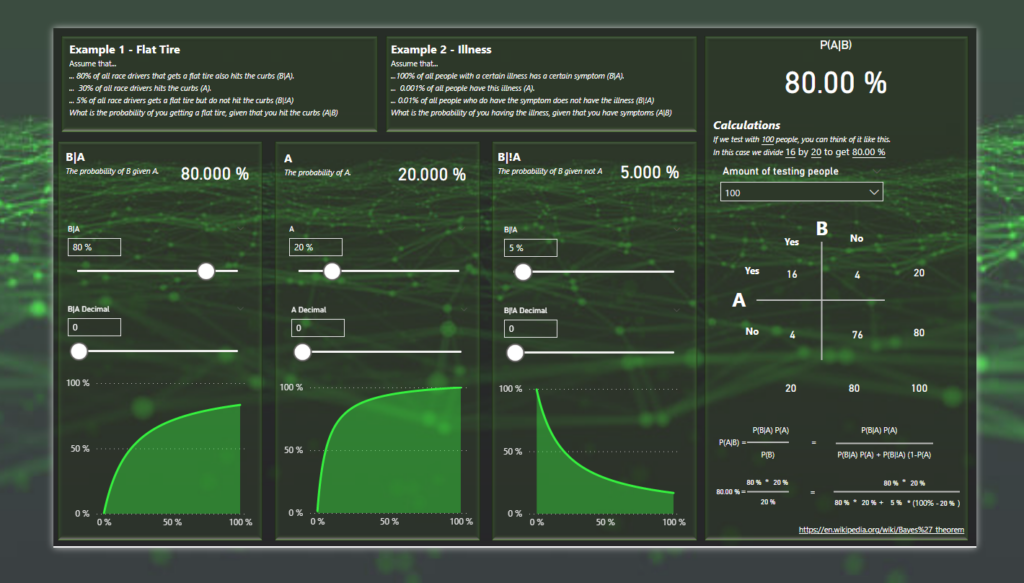
First you need to set your parameters to create probabilities. You do that by using the sliders.
As you can see, the first slider set the full precentage and the second sets a three digit decimal. To get 80.59% you need to remember that the decimals are always 3, so the decmial number should be 590.
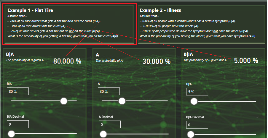
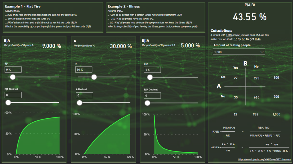
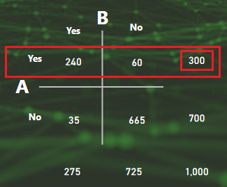
Let’s do example 1 from the report that you can use to try the calculator out! The sliders should then look like this:
The right side of the calculator will now show you the probability as well as the calculation behind it!
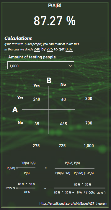
In this example I have selected 1000 people for my calculation. These 1 000 people will be spread out across the matrix into 4 squared. The amount of people where both A and B is true, where A is true but B is false, where B is true but A is false and finally where both A and B is false. The numbers on the sides are the sums of the rows and columns.
To get the probability of A given B, we’ll take 240 people and divide by 275.
At the bottom you also have the formula written out and the numbers you selected on the sliders added in the formula to show the steps of calculating.
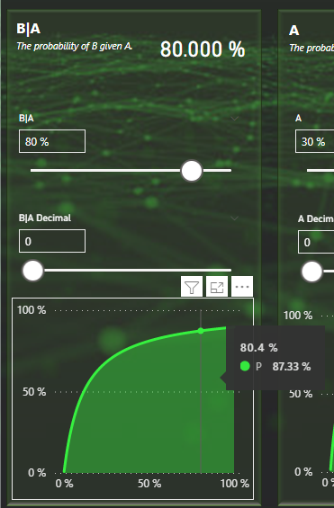
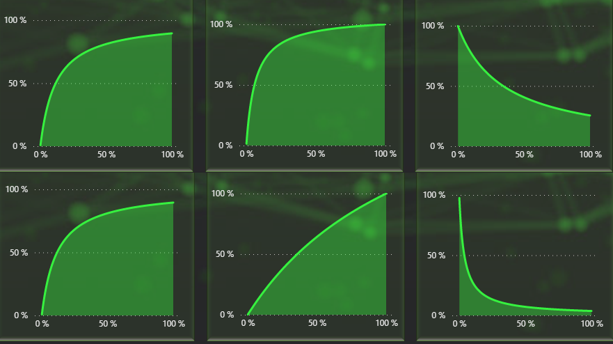
So how about the simulation? Under each input box you have a graph that shows the probability given that this value was set to a certain precentage.
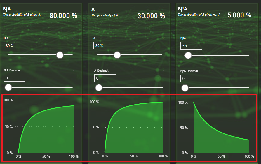
This can be used to visually see how changing the value would effect the probability. Let’s for example look at B|A. We’re currently at about 80% and the outcome is then 87,27%. By hovering over 80% on the X axis we can confirm this is also the case.
We don’t need to change the slider to determine that having B|A set to 9% would render P(A|B) to about 43,55% given that A and B|!A stays as they currently are.
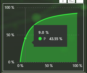
Setting the slider to 9% confirms that the probability is now 43,55% but it also changes the other graphs! This is because they to are calculated based on the other values being what they are. By changing B|A into something else, they have now changed their shapes.
This is the before and after graphs. You can see that B|A is the same but the others have changed.
You can also use the matrix here as an assistance to understand better how the different variables comes into play.
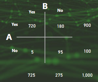
Going back to the initial setup, I have P(A) set to 30%. For 1 000 people, that means 300 people.
Changing the P(A) value upwards will mean a higher P(A|B).
If instead of 30%, we set P(A) to 90%, that means that 900 people out of 1 000 hits the curb (A), leaving only 5 out of a 1 000 people that hit’s the curb but doesn’t get a flat tire. Now most people get flat tires when hitting curbs and if you are one of those people, your probability of getting a flat tire is also going up. 700 people would not get a flat tire at all before but now only 100 people stand flat tire-less after racing.
How it was built
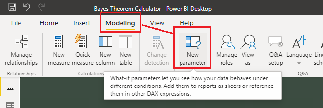
First of all, I’ve created a bunch of What-If parameters!
I needed 3 values as inputs to the calculator:
- A
- B given A
- B given not A
I wanted these percentages to be really, really granular! There is however a limitation in Power BI. If you put to many values into a visual or a slicer, Power BI will inform you that you’ve exceeded the limit of values that can be shown and you will instead get a sample of the values. In my case that’s not optimal as it would hide away many of the possible decimal values.
The solution was to create 2 parameters per value! First the full precentage and then the 3 digit decimal as a separat parameter.
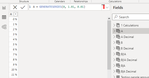
The parameter A looks like this
And A Decimal looks like this:
A = GENERATESERIES(0, 1.01, 0.01)
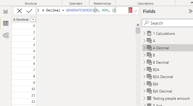
A Decimal = GENERATESERIES(0, 999, 1)Getting the selected P(A), i.e. the probability of A, I would need to combine these two values. That formula looks like this:
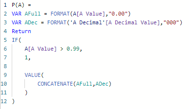
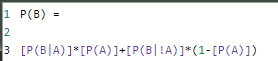
P(A) =
VAR AFull = FORMAT(A[A Value],"0.00")
VAR ADec = FORMAT('A Decimal'[A Decimal Value],"000")
Return
IF(
    A[A Value] > 0.99,
    1,

    VALUE(
        CONCATENATE(AFull,ADec)
    )
)
First I create a paremeter of the full precentage using the format formula. This way I can specifically say I want to format it as 0.00. Selecting 46% would result in this value being 0.46.
Second I create a variable for the decimal that is formatted using three zeros. This way, if you select the number 15 it will actually be presented as 015. This is important because when I’m concatenating the two numbers, 1 and 10 and 100 would otherwise be the same decimal.
All my other What-If parameters are created the same way as P(A) above. When these measures are done, it was time to create P(B)!
It looks like this and as you can see, it’s based on all the other measures I’ve created from above.
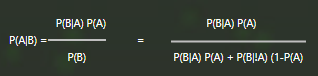
With this, I’m finally able to create a measure for P(A|B) like this:
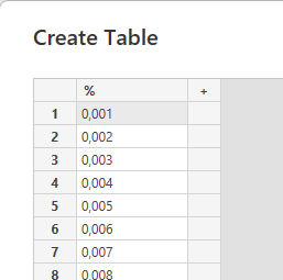
Allright now to create the simulations! First I created a new table of my simulating values in a table called the X-Axis. I did this in Power Query by simply pasting in all these numbers and setting them as type %.
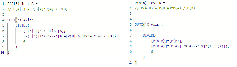
I then went ahead and created these three measures. Each measure goes into a graph each depending on what we’re testing.
This is the sample of testing B|A. As you can see in the formula, I’m using a SUMX which will go through every row of the X Axis table to preform an expression. Each row is a new test and for each row the measure will try that row value as B|A in the formula.
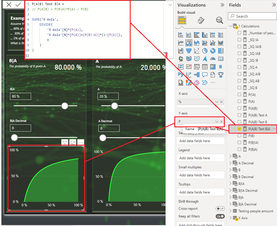
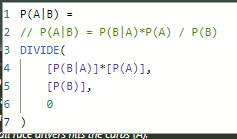
P(A|B) Test B|A =
// P(A|B) = P(B|A)*P(A) / P(B)

SUMX('X Axis',
    DIVIDE(
        'X Axis'[%]*[P(A)],
        'X Axis'[%]*[P(A)]+[P(B|!A)]*(1-[P(A)]),
        0
    )
)
The same procedure is done for the other tests as well and I simply just change different parts of the equation depending on what we want to test.
If you want to dig into the sample report or improve it further you can find it here in github!
Any feedback is also always welcome of course! You can reach me on twitter or LinkedIn. Well you can also leave a comment here of course!
Cheers!
I’m currently following a Math Class and found your web page, nice work.
https://www.udemy.com/course/math-for-data-science-masterclass/