Measure Distance dynamically
Some time ago I had a discussion with a friend of mine about the selection of comparable data. We talked about how schools were compared and expected to achieve the same results of they could be grouped as similar. The problem is that you have to define what parameters to look at for them to be comparable. In this case, all schools were compared between two municipalities that was supposed to be very similar. When taking a closer look, my friend could determine that one of the municipalities was very small and each school was very close to the others while in the other the area was much greater and so was the distance between schools. Teachers could easily cover for each other over school boundaries in one instance but not the other. Clearly other parameters had been taking into account when claiming these were similar.
This is the backstory of how I started to think about measuring distances in Power BI and this particular Friday evening I found myself testing some theories. Here’s the results!
The setup
I began by creating these two, totally not made up, tables manually by randomizing some data in Excel.
I have a Schools table with 4 available schools like this.

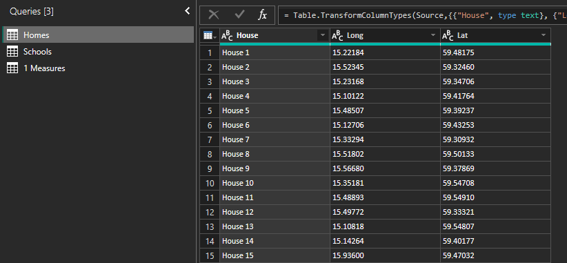
And a Homes table with 1 000 households like this:
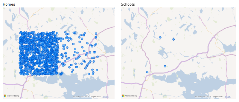
The tables aren’t related in the model and I just put in the Long and Lat in 2 maps to show where all the totally real households are and where the totally real schools are:
Test case 1 – Calculated Table
OK so I wanted to know what schools are the closest per household! I wanted to group all the dots on the left map like this:
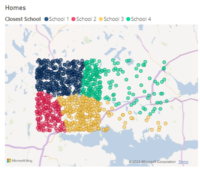
Here’s how I did it by first testing with a calculated column. I set up a new DAX table named “Homes to Schools” and the end results look like this:
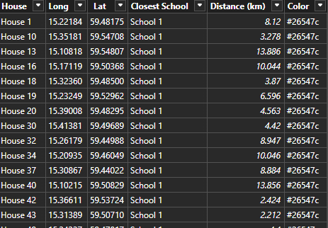
To get there, let’s review the DAX code.
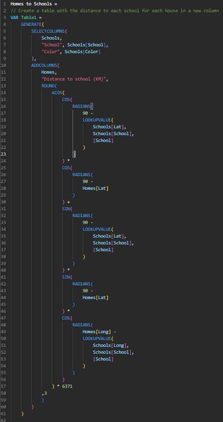
Step 1 is to create a DAX table with all Homes and all Schools so that I can have a column with the distance from each home to each school. This formula looks like this.
It takes the School and Color fields from the School table and combine it with the Homes table. In the second table (Homes) it adds a new column named Distance to School (KM) in which it calculates the distance from that specified home and school.
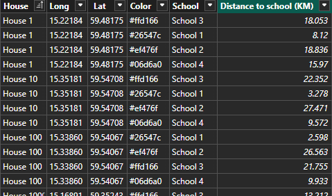
The outcome of this formula is a table that looks like this:
Each house is combined with each school and I now see the distance in KM to each school. Great step 1!
Time for step 2. I take the first table and filter it per house so that each House only keeps the row with the lowest distance to school.
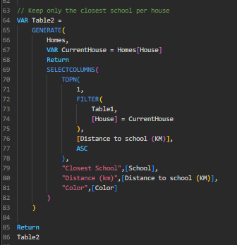
The complete code looks like this:
Homes to Schools =
// Create a table with the distance to each school for each house in a new column
VAR Table1 =
    GENERATE(
        SELECTCOLUMNS(
            Schools,
            "School", Schools[School],
            "Color", Schools[Color]
        ),
        ADDCOLUMNS(
            Homes,
            "Distance to school (KM)",
            ROUND(
                ACOS(
                    COS(
                        RADIANS(
                            90 -
                            LOOKUPVALUE(
                                Schools[Lat],
                                Schools[School],
                                [School]
                            )
                        )
                    ) *
                    COS(
                        RADIANS(
                            90 -
                            Homes[Lat]
                        )
                    ) +
                    SIN(
                        RADIANS(
                            90 -
                            LOOKUPVALUE(
                                Schools[Lat],
                                Schools[School],
                                [School]
                            )
                        )
                    ) *
                    SIN(
                        RADIANS(
                            90 -
                            Homes[Lat]
                        )
                    ) *
                    COS(
                        RADIANS(
                            Homes[Long] -
                            LOOKUPVALUE(
                                Schools[Long],
                                Schools[School],
                                [School]
                            )
                        )
                    )
                ) * 6371
            ,3
            )
        )
    )

// Keep only the closest school per house
VAR Table2 =
    GENERATE(
        Homes,
        VAR CurrentHouse = Homes[House]
        Return
        SELECTCOLUMNS(
            TOPN(
                1,
                FILTER(
                    Table1,
                    [House] = CurrentHouse
                ),
                [Distance to school (KM)],
                ASC
            ),
            "Closest School",[School],
            "Distance (km)",[Distance to school (KM)],
            "Color",[Color]
        )
    )

Return
Table2
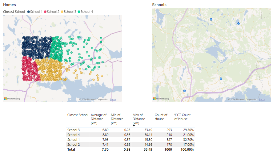
With this I can get lots of great information now! I can see the homes and the closest school in the map but I can also add some information in a table over each school to see for example average distance per household or who will have to travel the furthest to get to that school.
Question is. Can we do even better?
Test case 2 – Measures
The answer is of course; Yes!
What if we want to simulate some scenarios. The calculation above is only useful if we want to have static data and the whole point of Power BI is to interact with our data to get insights! We need measures so that the data is dynamically calculated!
I made a measure that gives me the distance to the closest school as long as it has the context of each home. This can of course be adjusted depending on your need but for the example, let’s keep it as is.
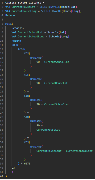
Closest School distance =
VAR CurrentHouseLat = SELECTEDVALUE(Homes[Lat])
VAR CurrentHouseLong = SELECTEDVALUE(Homes[Long])
Return

MINX(
    Schools,
    VAR CurrentSchoolLat = Schools[Lat]
    VAR CurrentSchoolLong = Schools[Long]
    Return
    ROUND(
        ACOS(
            COS(
                RADIANS(
                    90 - CurrentSchoolLat
                )
            ) *
            COS(
                RADIANS(
                    90 - CurrentHouseLat
                )
            ) +
            SIN(
                RADIANS(
                    90 - CurrentSchoolLat
                )
            ) *
            SIN(
                RADIANS(
                    90 -
                    CurrentHouseLat
                )
            ) *
            COS(
                RADIANS(
                    CurrentHouseLong - CurrentSchoolLong
                )
            )
        ) * 6371
    ,3
    )
)
Using the measure above I was able to determine which school is currently closest to the home with this measure:
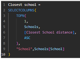
Closest school =
SELECTCOLUMNS(
    TOPN(
        1,
        Schools,
        [Closest School distance],
        ASC
    ),
    "School",Schools[School]
)
Now I can show the data in a table, like this:
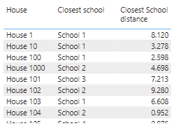
I made another measure that looks exactly like the one above except it gives the color field instead of the school name.
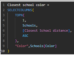
Why though? Well let’s have a look!
First, let’s look at my Map. It doesn’t have a legend, so how is it possible for the dots to be grouped?
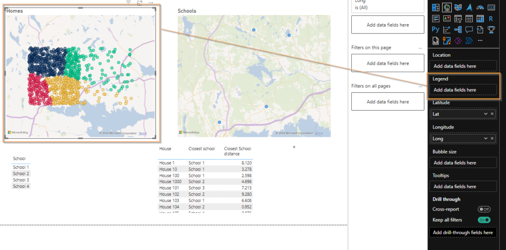
It’s because I’ve used a measure on the colors of the bubbles! This is why I needed a measure that will give me the HEX code from each school!
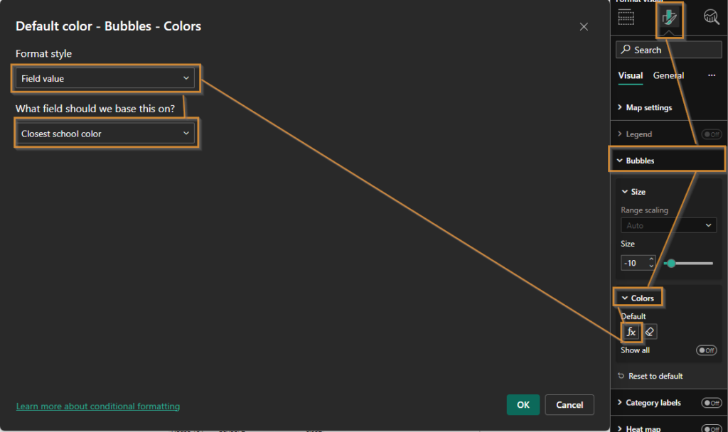
But enough of all of the technical background here. Why did I do test case 2? What’s the upside?
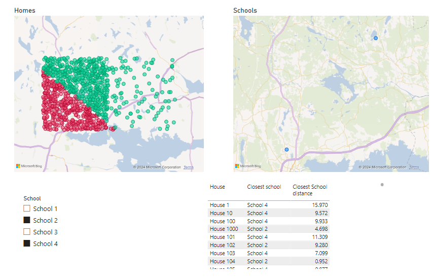
It’s because I wanted it to calculate dynamically! You see, if I select 2 schools from my list on the previous page, they’re the only ones available and so every home is recalculated on the spot to determine what, from the now available list, is the closest school.
Let’s say I now longer have School 3. Filtering that out generates a new map and reassigns each home to a new closest school as well as changing the closest distance in the table.
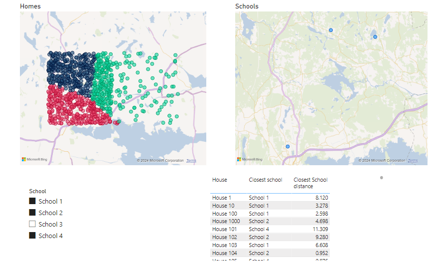
I was very impressed! Until I tried combining School 2 and 4.
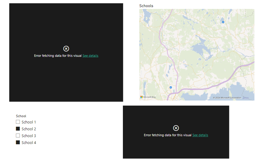
This error message could be found on “See Details”.

This is however a great scenario for me to take you with me on a journey to troubleshoot and fix this! Come along!
OK so the issue is that for at least one household, there’s probably exactly the same distance to school 2 and 4. It’s not a problem when I have the other schools available, meaning these households currently have one of those other schools as their closest.
To troubleshoot it’s actually a very good thing I created the table before because it can help me visualize the issue easier! The table doesn’t complain that there are multiple values.
In the calculated table from before, I just filter out school 2 and 4 on the initial step like this (before and after):

Now Table 1 will give me all the closest schools per home but only for school 2 and 4
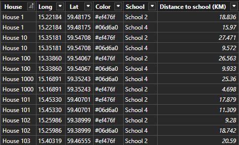
Now when I generate Table 2, I don’t get 1 000 rows but 1 001 (!).

Going back to the canvas and creating a table with each House and the number of rows from the table show me that House 96 is the issue!
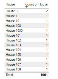
Going back to the table and filtering out that house, I can indeed confirm that both schools are exactly 21.528 KM from the house. What are the odds?

To solve this, I just need to be slightly more precise than use 3 decimals. If you recall from the DAX formula, on row 16 I use Round and on row 61 I specify the 3 decimals. Let’s increase it to 4 (or 15, it’s really up to you)
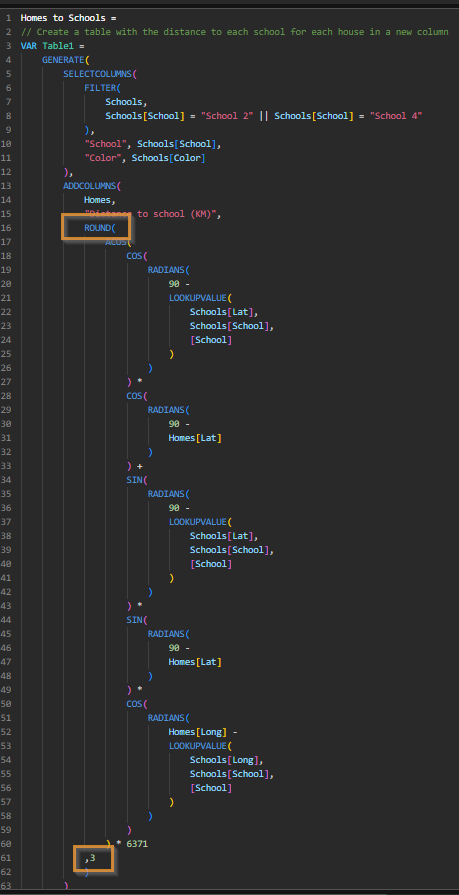
Increasing it to 4 solved my issue! I now have 1 000 rows again and only one House 96!

This means I simply need to change this in the measure now to fix my issue!
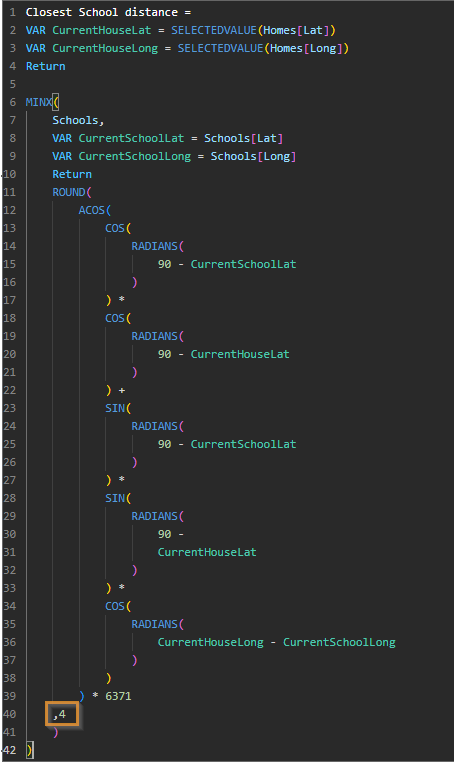
Voilá! I’m now able to select school 2 and 4 to divide all my 1 000 houses between only those 2 schools.
If you actually read this far, I’m really impressed! Hope you learned something. I sure did by building this and writing the blog post.
Cheers!