Service desk improvements in Power BI
Some time ago I was presented with Service desk data and I was recently asked to make a part 2 with more insights that could be drawn from this type of data. I though about another solution for a price development tool where I used What-if parameters of dates and that is actually a very good solution for this service desk post as well! Let’s dig in and I’ll show how this can visualize improvements over time!

The set up
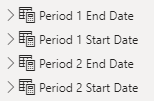
I started by setting up 4 calculated tables, just like in the other blog post. With these, we’ll be able to create 2 periods and compare them, giving a lot of freedom to the user of the report to draw their own conclusions.
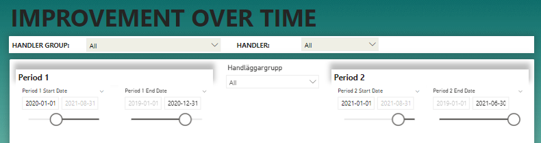
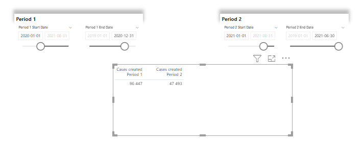
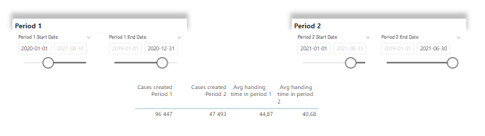
Next step is to put these slicers out on the canvas. I like to align them like this so it’s more obvious that the period is actually part of both slicers for each period. In the current example, I’ve set the entire 2021 as period 1 and I want to compare it with the first 6 months of 2021 as period 2.
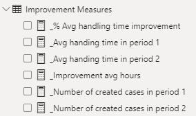
Next, let’s create some measures! I want to show the amount of cases that was created in period 1 and 2, the average handling time in period 1 and 2, the change of average handling time between period 1 and 2 and finally this number as a %.
For the cases in period 1 and 2, I use these measures.
_Number of created cases in period 1 =

CALCULATE(
    [_Number of cases],
    FILTER('Alla ärenden',
    'Alla ärenden'[SkapadDatum] >= 'Period 1 Start Date'[Period 1 Start Date Value] &&
    'Alla ärenden'[SkapadDatum] <= 'Period 1 End Date'[Period 1 End Date Value]
    )
)
_Number of created cases in period 2 =
CALCULATE(
[_Number of cases],
FILTER('Alla ärenden',
'Alla ärenden'[SkapadDatum] >= 'Period 2 Start Date'[Period 2 Start Date Value] &&
'Alla ärenden'[SkapadDatum] <= 'Period 2 End Date'[Period 2 End Date Value]
))With these measure, we can see the amount of cases side by side on the report.
To calculate the average time to complete a case, I use this measure and I use the column with the office hours. You can use this guide to get such a calculation yourself.
_Avg handing time in period 1 =
CALCULATE(
    AVERAGE('Alla ärenden'[Hanteringstid (timmar) Arbetstid]),
    FILTER('Alla ärenden',
    'Alla ärenden'[SkapadDatum] >= 'Period 1 Start Date'[Period 1 Start Date Value] &&
    'Alla ärenden'[SkapadDatum] <= 'Period 1 End Date'[Period 1 End Date Value]
    )
)
_Avg handing time in period 2 =
CALCULATE(
AVERAGE('Alla ärenden'[Hanteringstid (timmar) Arbetstid]),
FILTER('Alla ärenden',
'Alla ärenden'[SkapadDatum] >= 'Period 2 Start Date'[Period 2 Start Date Value] &&
'Alla ärenden'[SkapadDatum] <= 'Period 2 End Date'[Period 2 End Date Value]
)
)Now we’re getting somewhere! The handling time in period 2 is 4 hours lower than the handling time for cases in period 1. Neat!
Want to be more precise? Let’s make this measure to calculate the exact difference!
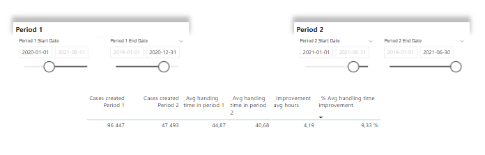
_Improvement avg hours = [_Avg handing time in period 1] - 'Improvement Measures'[_Avg handing time in period 2]With the above calculation, we can also get the percentage of increased (or decreased) improvement of average handling time in hours! To get it, I’m using this measure:
_% Avg handling time improvement =
// This makes sure there are cases created in both period to compare. If one of the periods don't have cases, it blanks out and the table is filtered to not show blank values
IF(
ISBLANK([_Number of created cases in period 1]) || ISBLANK([_Number of created cases in period 2]),
BLANK(),
DIVIDE(
[_Improvement avg hours],
[_Avg handing time in period 1],
BLANK()
)
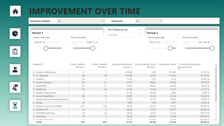
)This will look at the improvement and compare it to the average handling time in period 1. With all the numbers in place lined up nicely it will look like this! Now comes the magic!
Looking at the numbers above in 1 line is nice, sure, but it’s not fair to compare cases independent of some kind of context. But what if we change the list into a matrix and add 2 levels of categories as row headers?
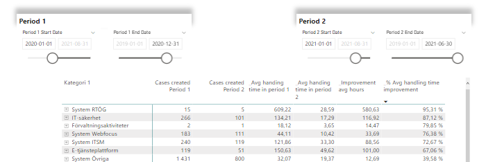
Here we can see the reason to blank out rows if there are no cases in period 1 or 2. For some categories we only had 2 cases in period 1 and 1 in period 2. A close call to say the least! If there are only cases in one period, we have nothing to compare.
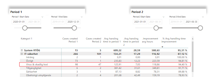
If we drill down to category level 2, we can see that handling of viruses has improved superbly! 94% shorter handling time on average of the 47 cases handled in period 2 compared to the 98 cases handled in period 1.
We might want to combine filtering with the handling group as well, like this! Cases handled by the 2nd line support-team by category. We can also see that you win some, you lose some, ey. There have been a bunch of increases as well, giving us negative improvements.
This technique is great for when you want to dig around in the data or when your driving improvements efforts for certain groups or categories and want to see the trend afterwards. Or if you want to check in and see if there are any trends you should be aware of in terms of un-improvement where effort should be made to correct the path!
Regardless of what you use it for, feel free to reach out with feedback or improvements to me as well 🙂
Cheers!
Related blog post
The previous post on Service desk data:
Here’s a link to the dynamic segments post:
The What-if post using dates