Sweden’s population in Power BI
I recently got my hands on some open data from the Swedish bureau of statistics (SCB). Anyone could download this from their site but apparently, not everyone is interested in spending Saturday evenings building Power BI reports (yes, I am about as confused as you are!) and since the data is just numbers unless you start putting them together into insight, I thought I’d share my creation. Even if you’ve seen these numbers before, you probably haven’t got this kind of flexibility.
Want to skip all of my explanations and just dive into the report? Sure thing! Click here on the image to open the externally published Power BI report. If you make any insights, please share them with me or the municipality/region to which they apply.

Using the Power BI Report
The report has two tabs at the top. On the left side we’re looking at simple population and on the right side we have income statistics.
We start on the Population-tab and this is also the tab showing above.

On the upper left side of the page, you’ll find the filters available.

The filters apply to the whole page and they’re useful if you for example want to se the visual trend of men and women living in a specific area and who are between certain ages.
In the example below I’ve set the filter from 2000-2013 in Nora and the ages between 15-45 years old. One important thing to remember here is that a person who have lived in this area during this time and is for example 40 years old in 2000 will be calculated during the first 5 years in the graph. At the age of 46, the person is no longer applicable. This usually solves itself as a person who is 10 years old in 2000 will be 15 at the same year our 46 year old leaves the graph, meaning you still get a good idea of the trend but it might be bigger differences the smaller age span you’re filtering on.

If you have no interest in split data between men and women, simply select the right side tab to show the graph as a complete summary instead!

On the right side of the screen you’ll find a bunch of call out numbers. Here’s an explanation to them and what they mean. In this example we can clearly see that many people are retiring to Nora.

Ever heard someone claim women live longer? It might not come as a surprise that we have plenty more women than men living in the country between the age 75-100. If you live in Sweden, have a look at these metrics for your own municipality. What insight do you get?

Next let’s have a look at the income tab! You’ll find it on the upper right corner of the page.
To simplify I’ve made it use the same structure as the population page and the call out values means the same as before, i.e. the development from first to last year.
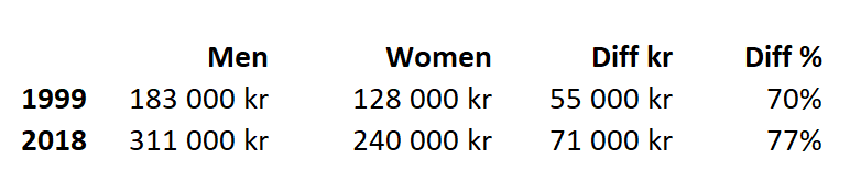
In here we see annual income and you don’t even need a trained eye to spot the wage gap here, do you? Have a look at this overview. Notice that the men has made a 71% increase in annual salary while the women got a 89% increase! This should be a good thing and it should mean that women are closing in and the wage gap is getting smaller. Now look at the actual numbers. Since the men started so much higher than the women, a 71% increase of their starting value still results in a higher amount of money than the women’s 89% increase of their initial starting value.

Put in another way, the average women made 70% of what a man earned in 1999 and 77% of what a man makes in 2018. This should be an improvement! However when looking at the actual sums, the gap has increased. It’s actually about 130% of what is was before.
Another interesting insight is that for the youngest age groups, the women are actually ahead. Perhaps we are looking at a more fair future after all?

How the report is built
To be able to filter the way we’re doing in this report we actually need quite a few rows. For the Income, we have 162 400 rows.
Each row consists of the income in Swedish crown, the year, the municipality, the age group and the sex.

For the population, we’re not limited to an age group meaning that for every year, municipality and gender, there’s 100 rows for the age represented. Since we’re also stretching all the way back to 1993, this sums up the a little more than 6,3 million rows (!). Something to consider when using the report. If you’re using this report to impress your boss at work, mention that you’ve been crunching more than 6 million rows of data just the get them that insight you’re presenting. Sounds nice, right!
And to be fair, do admit the report runs pretty smooth when filtering for something that consists of this amount of rows. Imagine having this in an Excel file and trying to make the same kind of insights. If this is enough to sway you into trying Power BI, please deposit 0 kr and download it for free from Microsoft Store to get started.

Calculation the development
I’m using this formula to calculate the development of population in %.

Population utveckling % = (CALCULATE(SUM('SCB Population'[Populaton]),FILTER('SCB Population','SCB Population'[Year]=MAX('SCB Population'[Year]))) / CALCULATE(SUM('SCB Population'[Populaton]),FILTER('SCB Population','SCB Population'[Year]=MIN('SCB Population'[Year]))))-1The first part simply calculates the amount of population at the last selected year and divides it by the amount of population at the first selected year, then removes 100%. Power BI will automatically calculate this over and over again depending on the context we’re putting the measure in, so when for example filtering on women only – it takes that into consideration and I’m actually using this same measure for all these places in the report.
If you have any questions, please feel free to reach out in the comments or on my Twitter account @Villezekeviking.
Let’s uncover the world of data together and inspire people to embrace the potential of today!
Thanks for one’s marvelous posting! I actually enjoyed reading it, you could be a great author.I will make certain to bookmark your blog and may come back later in life. I want to encourage you to definitely continue your great posts, have a nice morning!