The Pareto table in Power BI
How do we determine priorities? Let’s assume the role of an incident manager or someone in charge of damage control of any sort. How do you determine where to focus your finite resources? We would like to do everything of course, but that is extremely rarely possible. So where do we start?
One very common way is to simply prioritize based on who is screaming the loudest. This would have given a great advantage for Chester Bennington (may he rest in piece), but regardless of how much I love hes music, I would like to introduce another solution; the Pareto principle.

The Pareto principle states that for many outcomes, roughly 80% of consequences come from 20% of the causes. Even if it’s not always the case, it’s still useful to use the principle and find which causes stands for 80% of the consequences even if it’s not exactly 20%.
In our role as the incident manager we might look at IT Servicedesk incidents. We could for example look at the amount of time spent on each incident summarized by category and sum the biggest categories until we get 80% of all the time spent. Perhaps we would only get 3 out of 50 which is no where near 20%, but these 3 might take 80% of the total time to handle. Let’s say it’s passwords, printing and Software requests. You may have 50 categories and many more cases in other categories, but since these 3 takes up most of your servicedesks time to handle, start mitigating these issues to save the most time and when you’re done, redo the analytic and make new priorities based on the new current state.
Let’s take a look at this in Power BI, but as the role of a road traffic damage control officer, a quite possible made up title but hopefully you’ll get the idea here. Your role is to prioritize resources on making the roads more safe. As it happens, you have access to a dataset of about 3 million rows of incident data (thanks Kaggle.com).
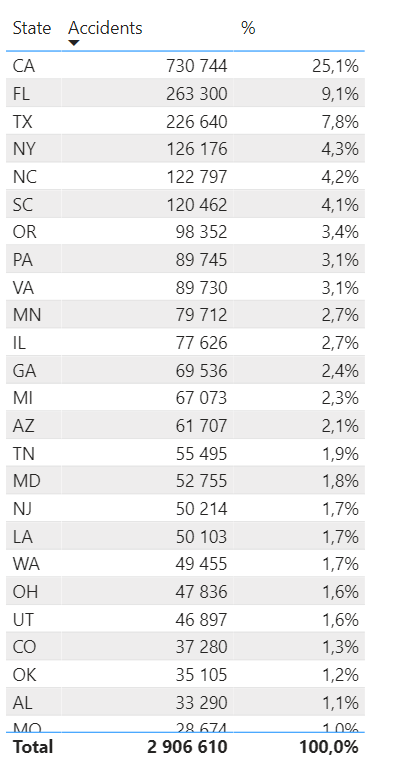
We have a lot of data here. First step is to determine useful categories or dimensions. Let’s assume that we are in charge of the US overall safety and with this dataset we want to determine which states to focus our resources towards. We start by sorting accidents by state in a simple list, with the biggest amount on top. We also show the percentage of the grand total since this is a crucial part of our pareto calculations. It might look something like this.
To create the precentages I made a measure. I could have just showed value as % of grand total but we’re going to use this measure later on so I made it like this:
_% accidents = DIVIDE([_Amount of incidents] ,CALCULATE([_Amount of incidents],ALLSELECTED(States)))Next we want to accumulate the percentages. We could use the built in quick measure running total in Power BI, however that require us to provide a field value. At this point we don’t have anything. We need the rank of each state. We get this by creating a measure like this. If you have a sudden urge to make this rank calculation in a column in the dataset, fight this urge with all you got. I’ll show you why a measure is like magic at this phase.

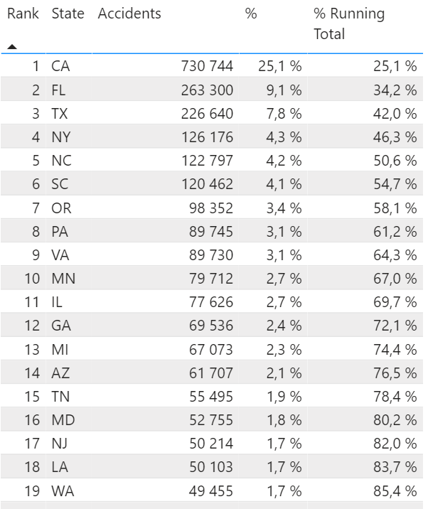
_State Rank = RANKX(ALLSELECTED(States),[_Amount of incidents],,DESC,Dense)Using the Rank we can now get a bit more advanced and create a virtual table of the states, rank them and calculate the percentage summarized for all States with the same or lower rank. This is what it looks like:

_% accidents running total =
Var CurrentRank = [_State Rank]
Return

SUMX( FILTER( SUMMARIZE(ALLSELECTED(States),States[State],"Rank",[_State Rank],"% Running Total",[_% accidents]), [Rank] <= CurrentRank), [% Running Total])
This formula will first save the States current rank as a variable. Then it will use Sumx that loop through each row of a table. The Table is a filtered virtual table based on the States. When the calculations are made for a specific row, the table will only contain the state itself and any state with a lower rank.
Thanks to our measure we now have a column in our list that shows a growing percentage for each row.
Oh and on a cool side note. This column does not require the Rank to be part of the visualization. If we remove it, the numbers stay the same! Pretty nice, huh?
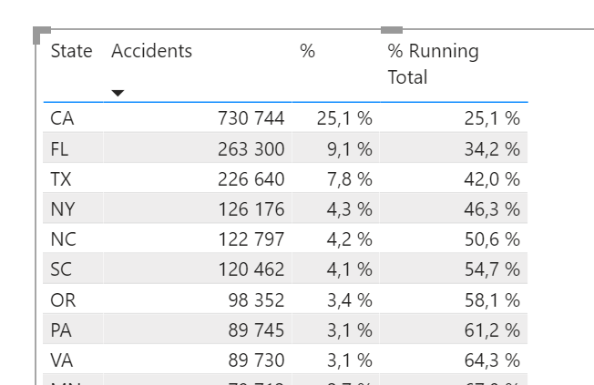
Let’s make some nice touches to make this more readable. This is made by conditional formatting the rows of our list. We’ll set the rules for each value (State, accidents etc). Go for the Font color:

The rule set should look something like this:

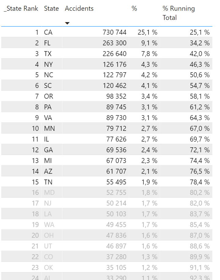
The result will make the list look like this! Anything above 80% is clear and dark, the rest is a bit grey. I decided to bring back the Rank to make it more clear how many states are in range for our focus.
And now for the magic! I told you to hold back the urge of creating a column with static rankings and percentages. We want everything to be a measure because a measure is calculated in the context it’s in! If we pre determined that we simply wanted the current rank for all accidents we would now be stuck with that number. Making a measure gives us the abilities to dive deep into the data! Let’s for example set the context to any accidents happening at around 19:00 (rounded to closest hour).

Since we began this blog post as a made up road traffic damage control officer, let’s continue down that path and add to our story. The HQ just sent word! They need us to re-allocate our resources based on Severity 1 accidents from 18:00 – midnight. We need a priority list yesterday! Fortunately it’s only takes us about 3 seconds the get the answer. 6 states causes just under 80% of all these accidents.

Could we go banans on the insights? Yes of course!
Amount of incidents between Florida and Texas based on the time of the day the accident happened on. Florida have more traffic accidents from midnight until 08:00. For 3 hours, accidents are statistically more common in Texas until Florida takes the lead from 12:00 – 16:00. The evening is worse in Texas and the night is worse in Florida. Road accident statistically speaking.

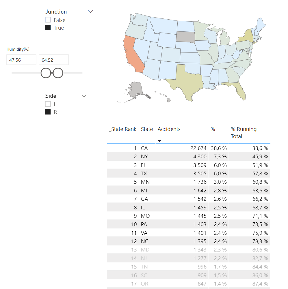
Ever wondered where to stay away from in terms of driving in a junction on the right side of the road with a humidity between 47,56% and 64,52%? Now you do!
The pareto principle can be used in more cases than I could possible exemplify here, but if you have a good idea and would like some support or assistance getting there, feel free to reach out!
Cheers!